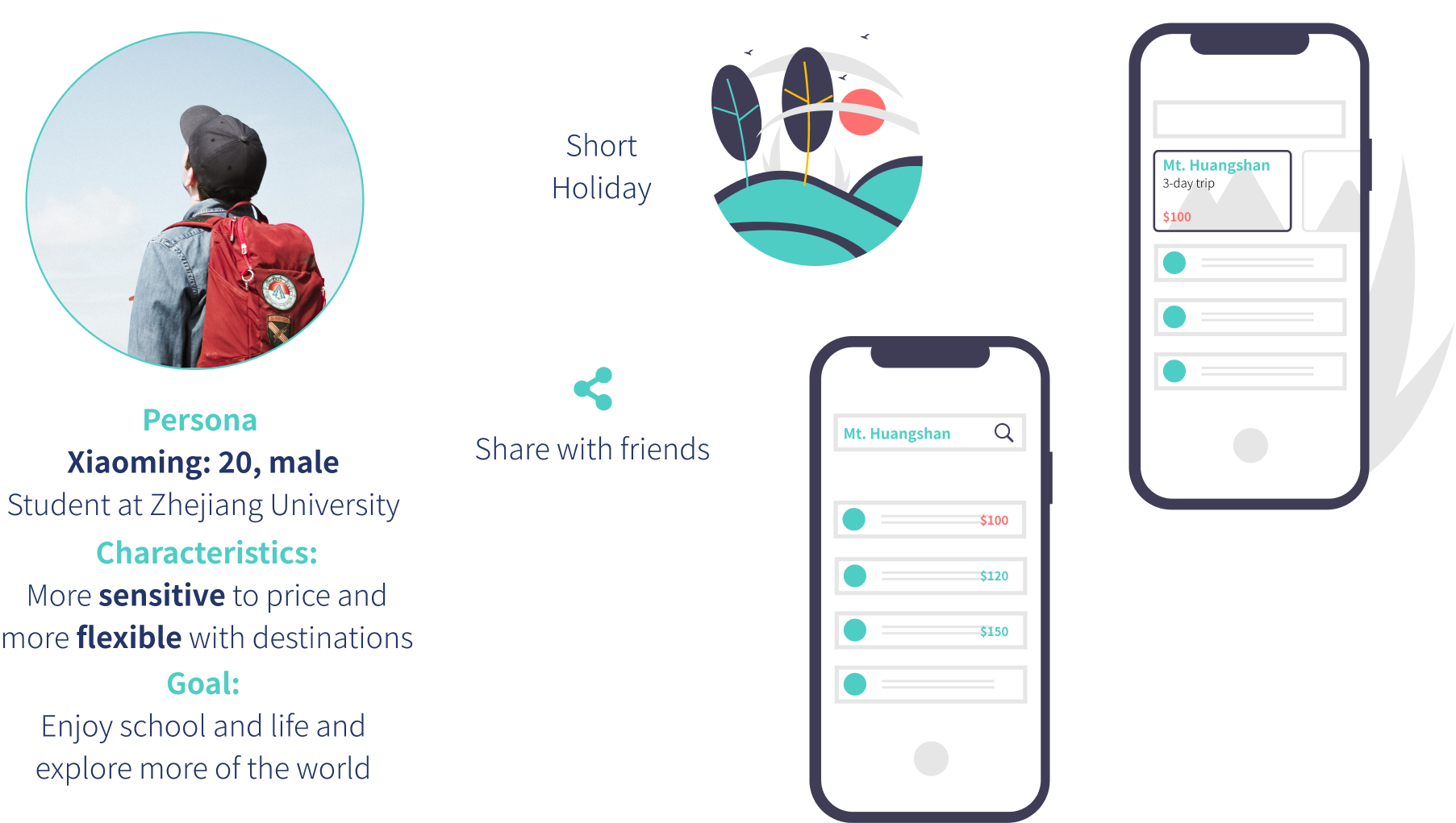
College students have more free time and like to travel. They would like to go out to neighbouring cities or scenic spots nearby on holidays.
Bus Rental
A 2-sided mobile platform matching clients’ orders & bus fleets’ offers
Overview
A traditional travel agency owning the contacts and resources of charter bus fleets wanted to digitalize their service onto a platform. They were also seeking new opportunities in the mobile Internet era and trying to start a new business with this digital platform. Popular apps like Uber and Didi reallocate the supply of resources according to instant demand: taxi drivers don't have to run on streets in idle to seek for passengers; neither do passengers have to wait for taxis passing by. While in tourism, charter bus fleets are contacted by travel agencies respectively. Why not reallocate these bus resources as well? It will be a more open market, and the usage ratio will increase.
Role
UI designer
Problem definition, prototyping, cognitive walkthrough, information architecture, wireframing, interaction, color scheme, high-fidelity mockups
Target User Groups
Clients
Agencies or individuals that rent buses for travel, business, rides or shuttle: they send out orders but are not necessarily passengers.
Bus Fleets
Administrators or operators of bus fleets that provides buses, vans, cars or other types of vehicles for rent: they bid for orders.
Drivers
Drivers who work for bus fleets: they are more of an executor role.
Understanding the Workflow
among Client, Bus Fleet and Driver apps
Personas & Scenarios
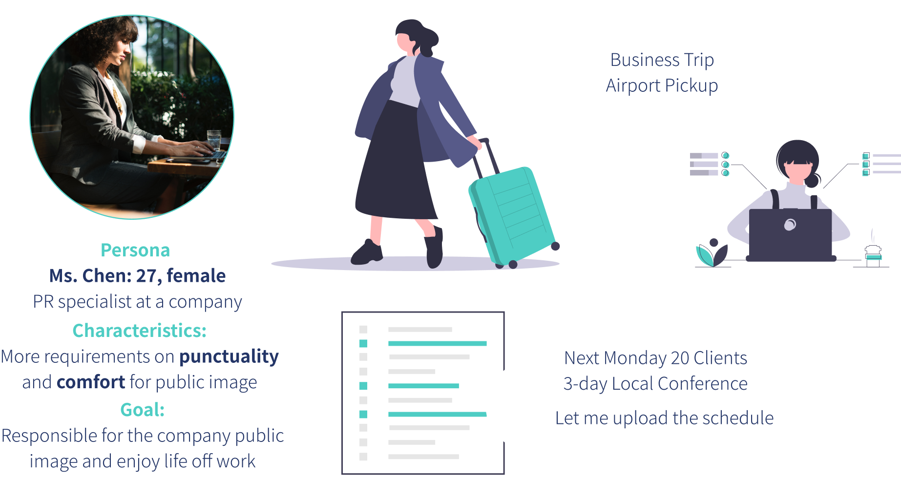
Public relations officers have to meet clients, company stakeholders and the press often, and go to conferences and exhibitions. They need to establish or maintain good public image for the company.
Wireframe
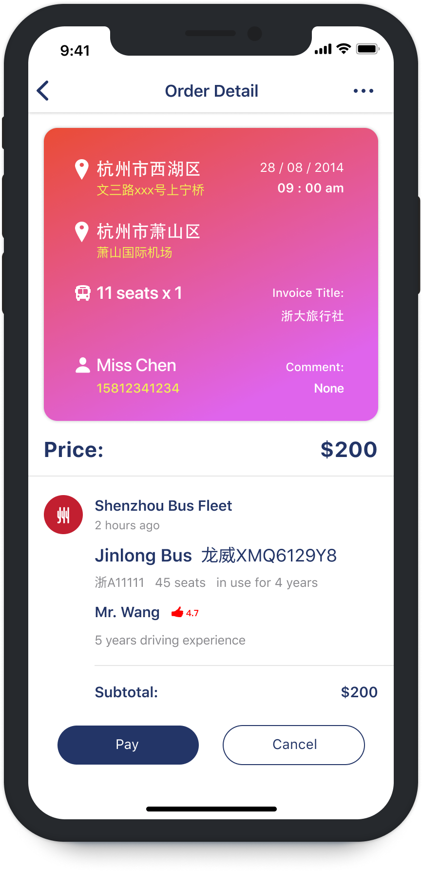
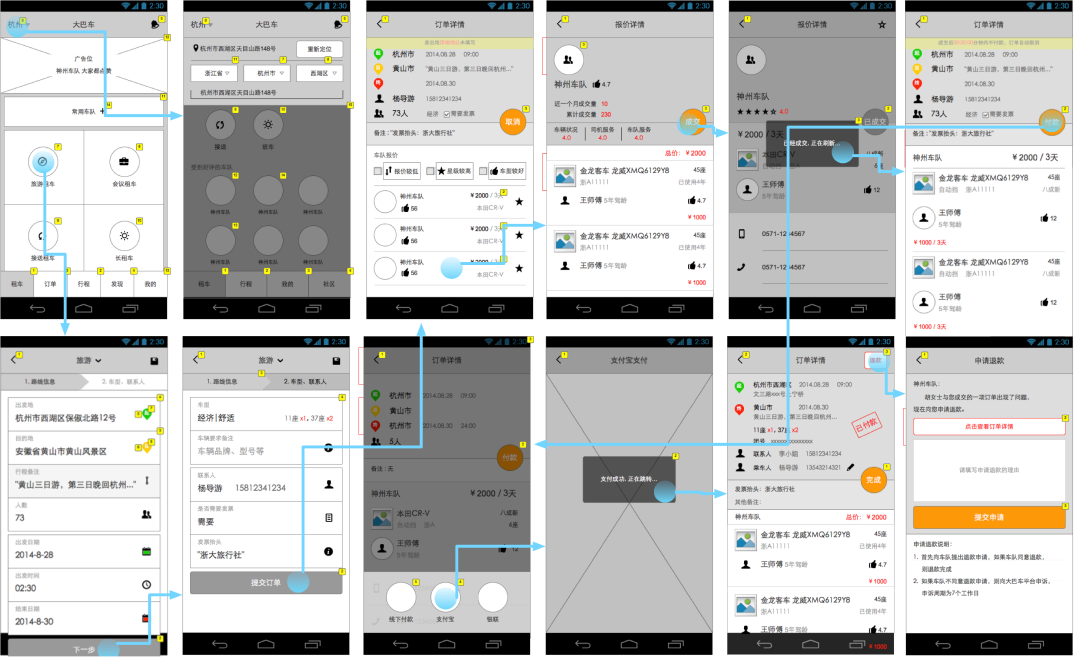
Workflow of client app from “Publish a request” to “Pay & complete order”.
Client Prototype
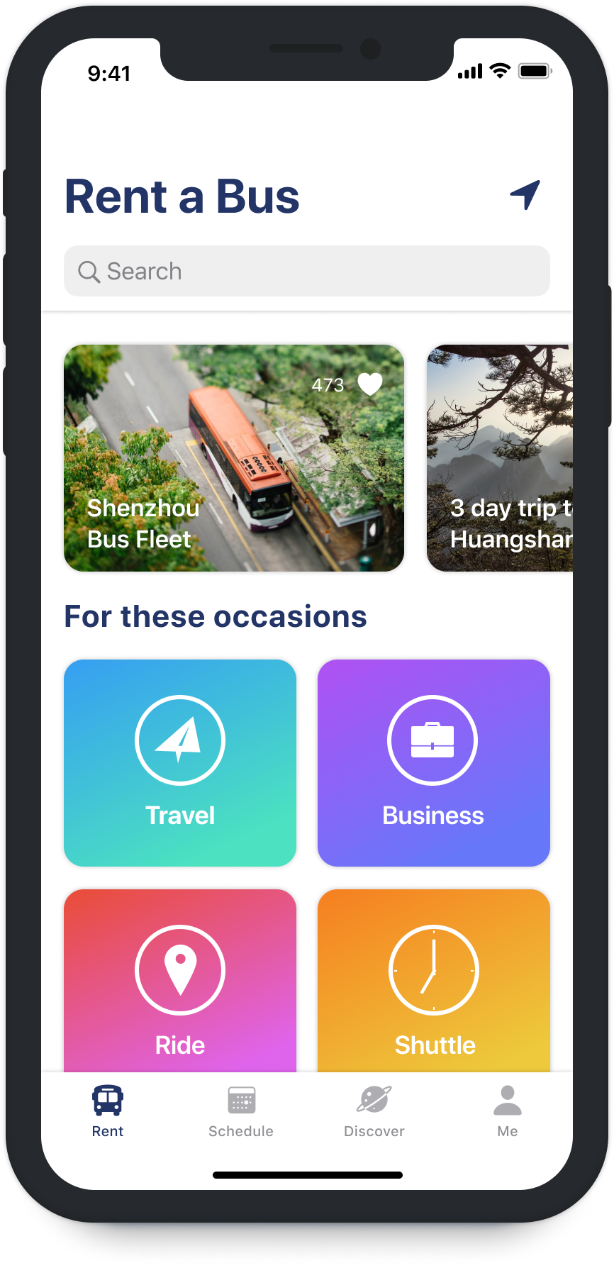
Landing Page
The first tab of the app should be for the most frequently used functionalities. Clients open the app to rent a bus for their needs, so the simplest way is to provide the entry to the rental service here. The four different types of services require different information, so they are divided and color coded through out the app.

Rent a bus for travel, business, rides, and shuttle service
Schedule
Schedule tab shows ongoing trips. For a travel agency, they may manage many trips at the same time. They need the key contact person information from the client side, bus fleet side, and the driver.
Ongoing trips in Schedule tab
Detail information of scheduled orders
Discover
Discover tab is for recommending bus fleets and discount trips.
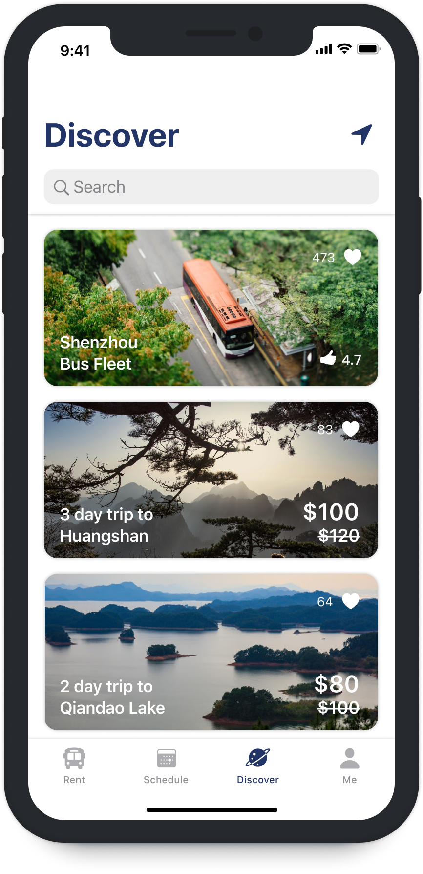
Discover tab
My Orders
In Me tab, there is a central order management screen. Users can see all order history here. The orders are organized according to their status: Ongoing orders include requested, ordered and scheduled orders; past orders include completed, finished, and cancelled orders.
Ongoing orders
Past orders
Key Takeaway
After the project, I reflected on the whole design process and found several key points to keep in mind:
-
For a platform consisting of multiple systems collaborating together, understanding the flow back and forth is the starting point before design. To go through the prototype flow, cognitive walkthrough is a great tool;
-
For a complicated quasi-ecommerce system, it is crucial to sort out order status on each screen and keep it consistent;
-
To relieve cognitive load for users, color coding and consistent graphic visual cues are applied. Users can grasp the scenarios more easily with these aids.