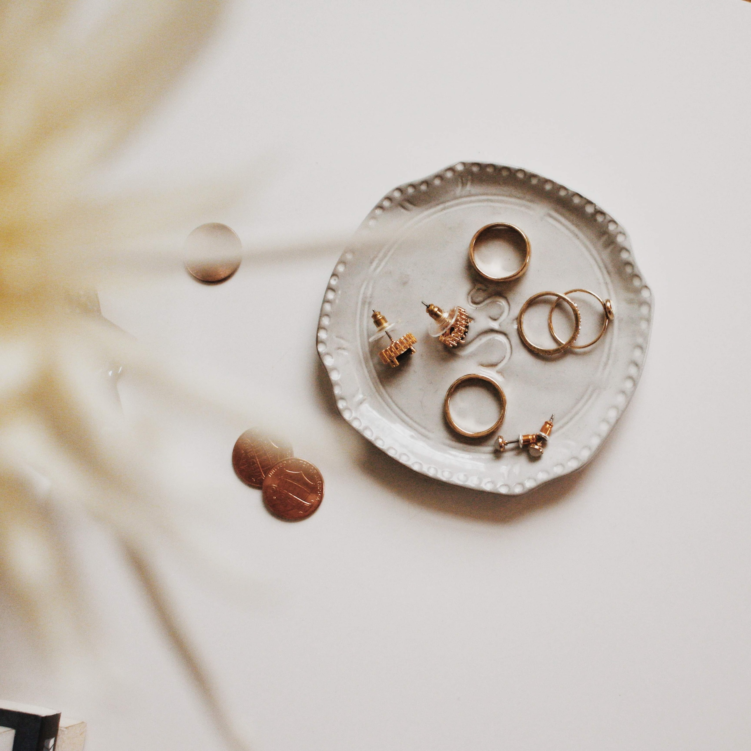
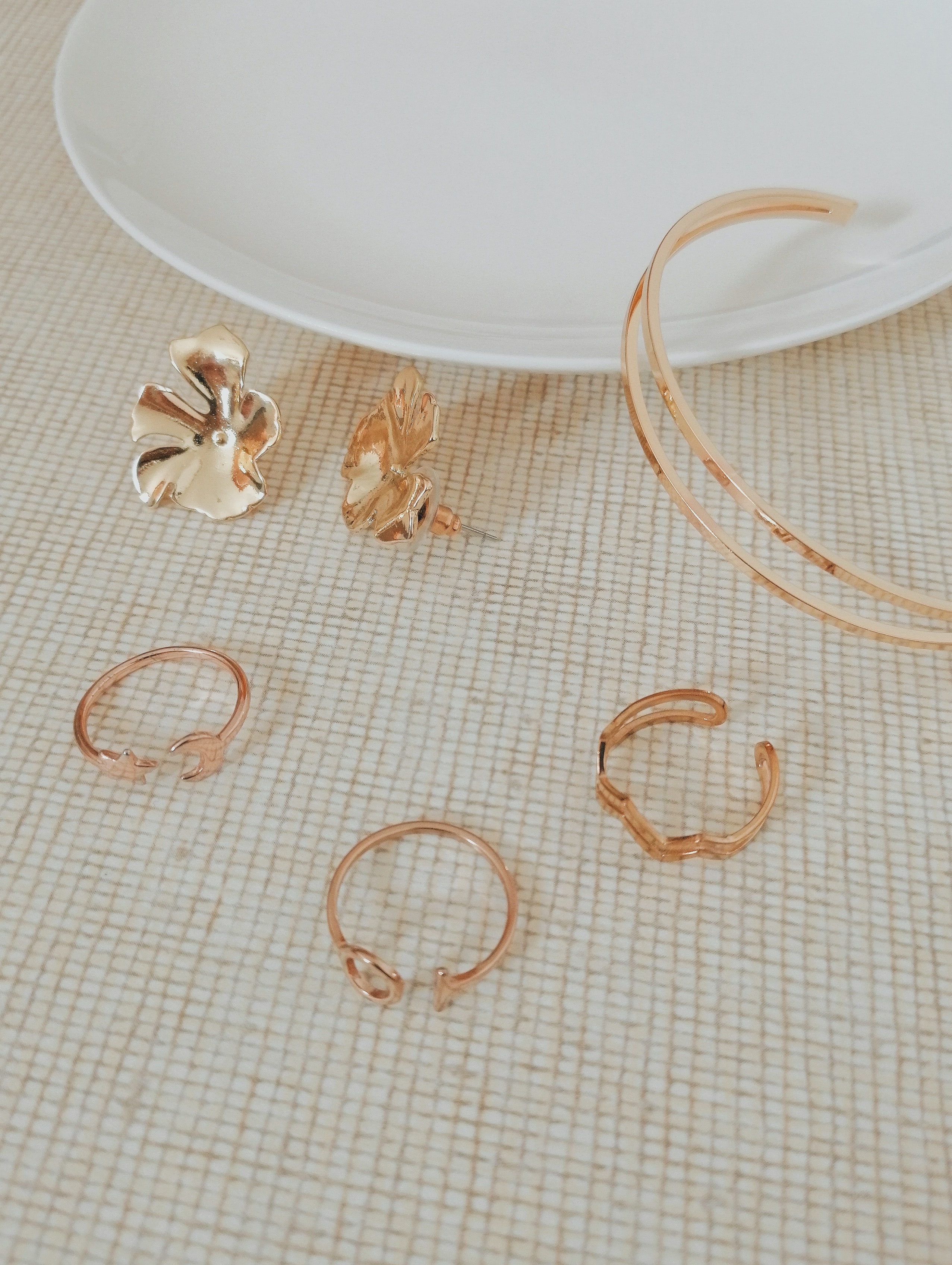
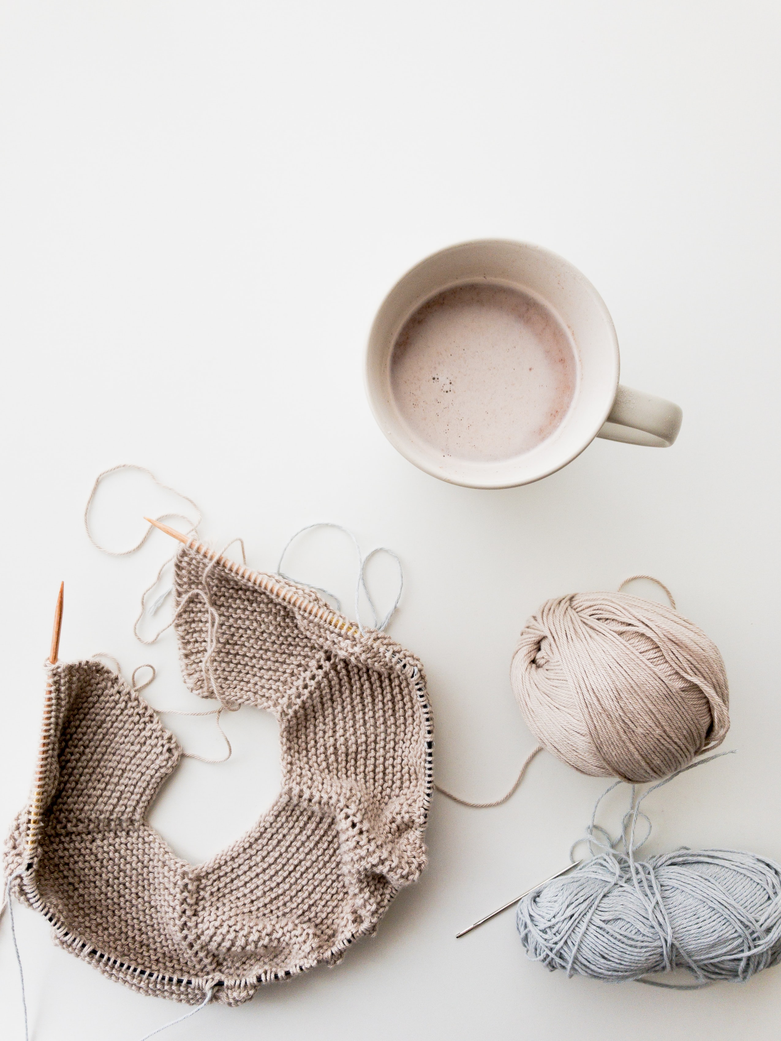
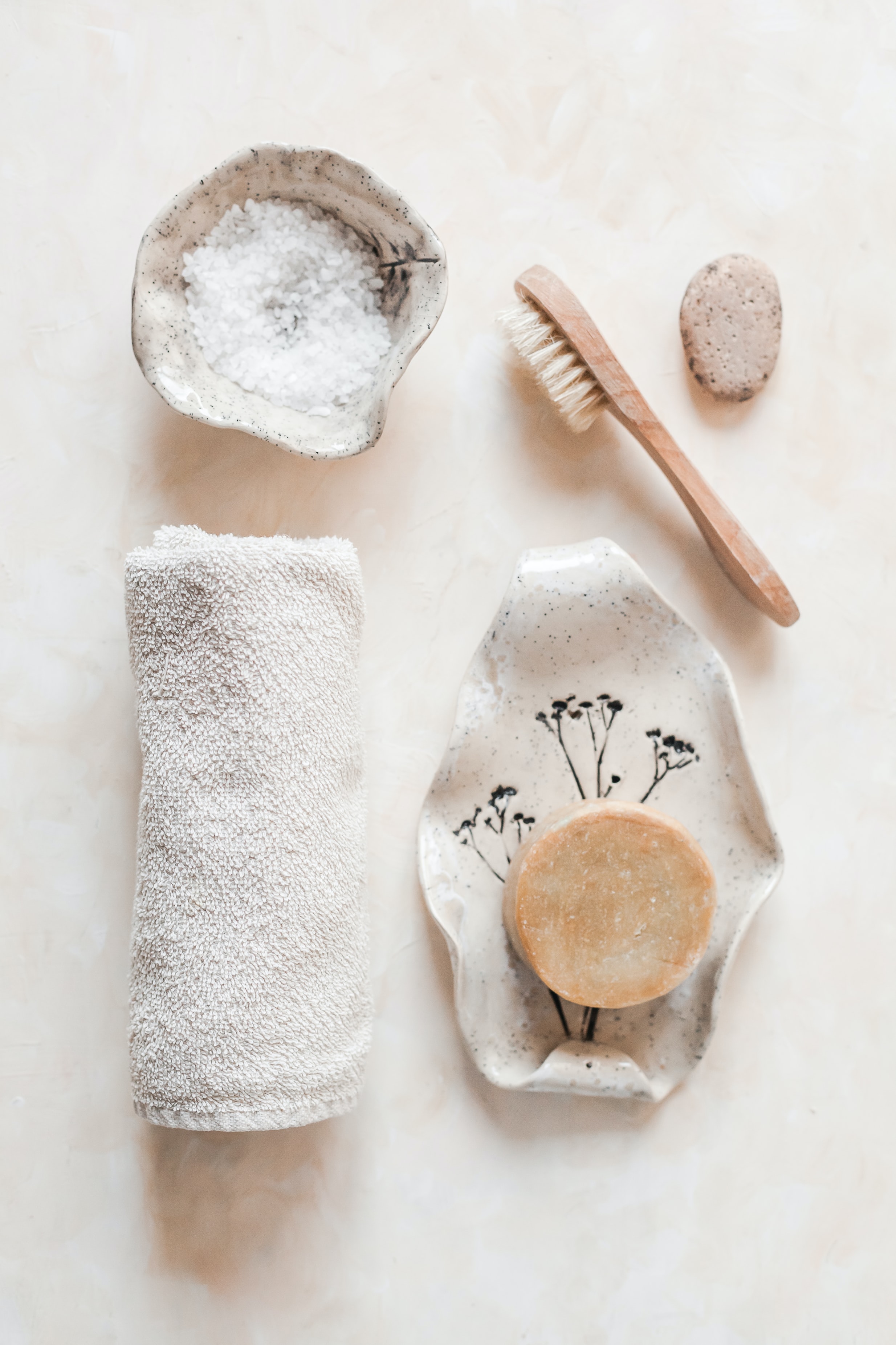
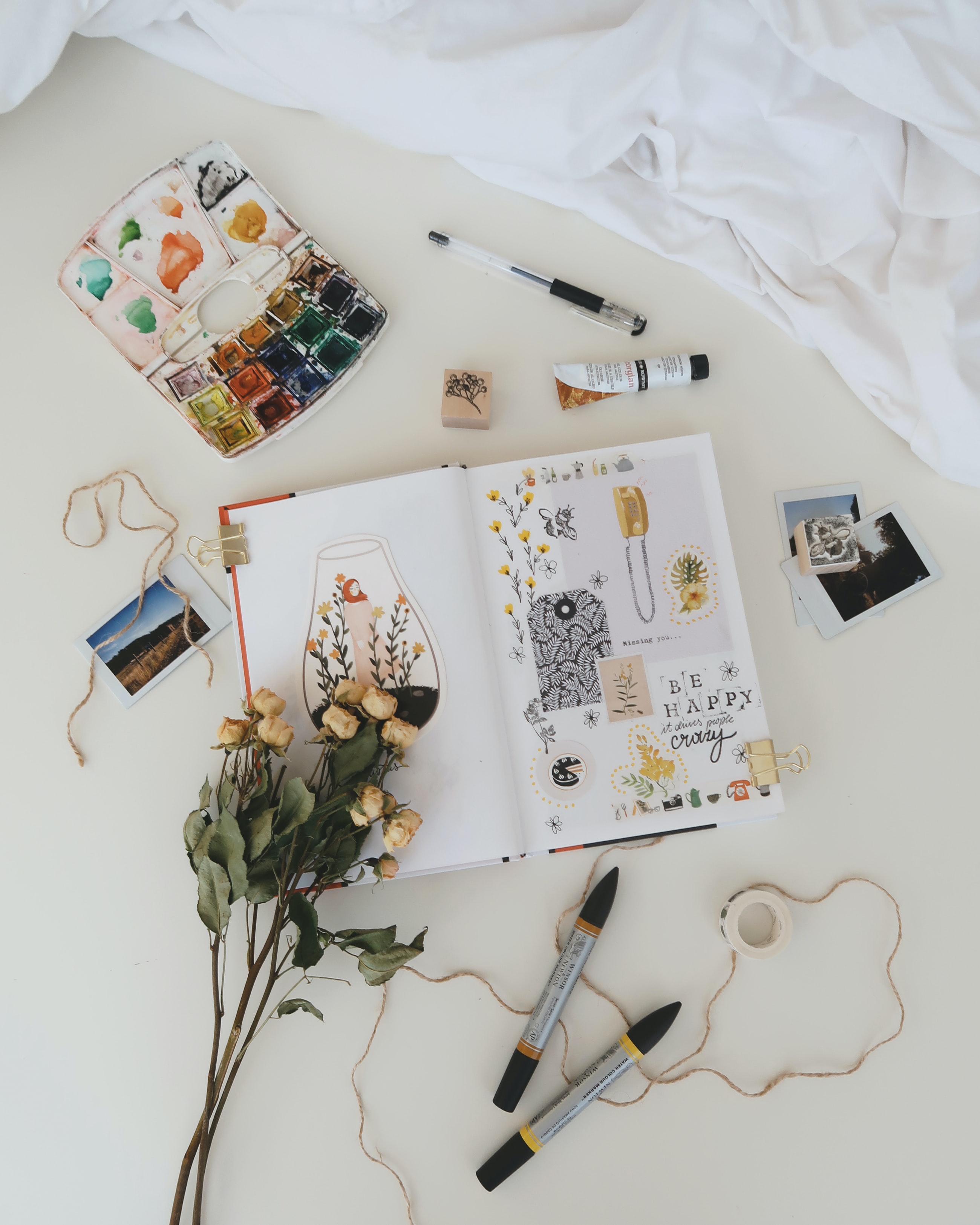
I extracted keywords that can represent the brand personalities, and interpreted them into visual images. The visual images then became the base tone for the moodboard, which gave me hints on the look and feel of the design.

Indie Jewelry
Brand Identity
Overview
The client was about to open her own online shop to sell her handmade jewelries. She does the design herself and also receives orders that request for customization. She wanted to show a brand logo for her online shop, as well as on her shipped packages. Her target customers are young women in their late teens and early twenties.
Role
VI designer
Brand research, moodboard, wordmark logo design, packaging design, visual identity
Brand Logo
The client's name Coi-Saan in Cantonese sounds very much like the English word "Chosen", which is a simple word known by most young people. So she wants to keep this word as her brand name. I chose a wordmark logo over a graphic one for the same reason: I want to help build the connection of her, her brand and her customers.
The shapes of the letters happen to look like elements in jewelry design. I tweaked the letters and added coherent visual clues to give them similar look and feel. I chose the color that generates a sense of relaxation and comfort, and also resembles the metal bronze.


