mockup

Remote ATC


Overview


ATC stands for Air Traffic Control. In Finland it is divided into 3 control units: Above 10000 feet, ACC (Area Control Center) controls the whole country; within 100 km range from the airport, departure and arrival control; within 5 km range from the airport, tower and ground control. SAAB is our project sponsor. They want to promote remote air traffic control centers and remote digital towers, and improve the safety of ATC and working experience for the air traffic controllers.

Role


UX designer
User research, problem definition, prototyping, user testing, information architecture, interaction, mockups

Air Traffic Controller Workflow


workflow

Info Systems


We went to observe air traffic controllers working in Helsinki Vantaa Airport. They mostly work with 7 information systems with the need of editing information on 2 : air radar, ground radar, flight plan (editing needed), lighting, weather, e-strips (editing needed) and radio. These information systems are quite old with 90s style UI, not updated at least for 5 years. They also stand up from time to time to check where airplanes have landed or taken off outside the tower.


info

Benchmarking


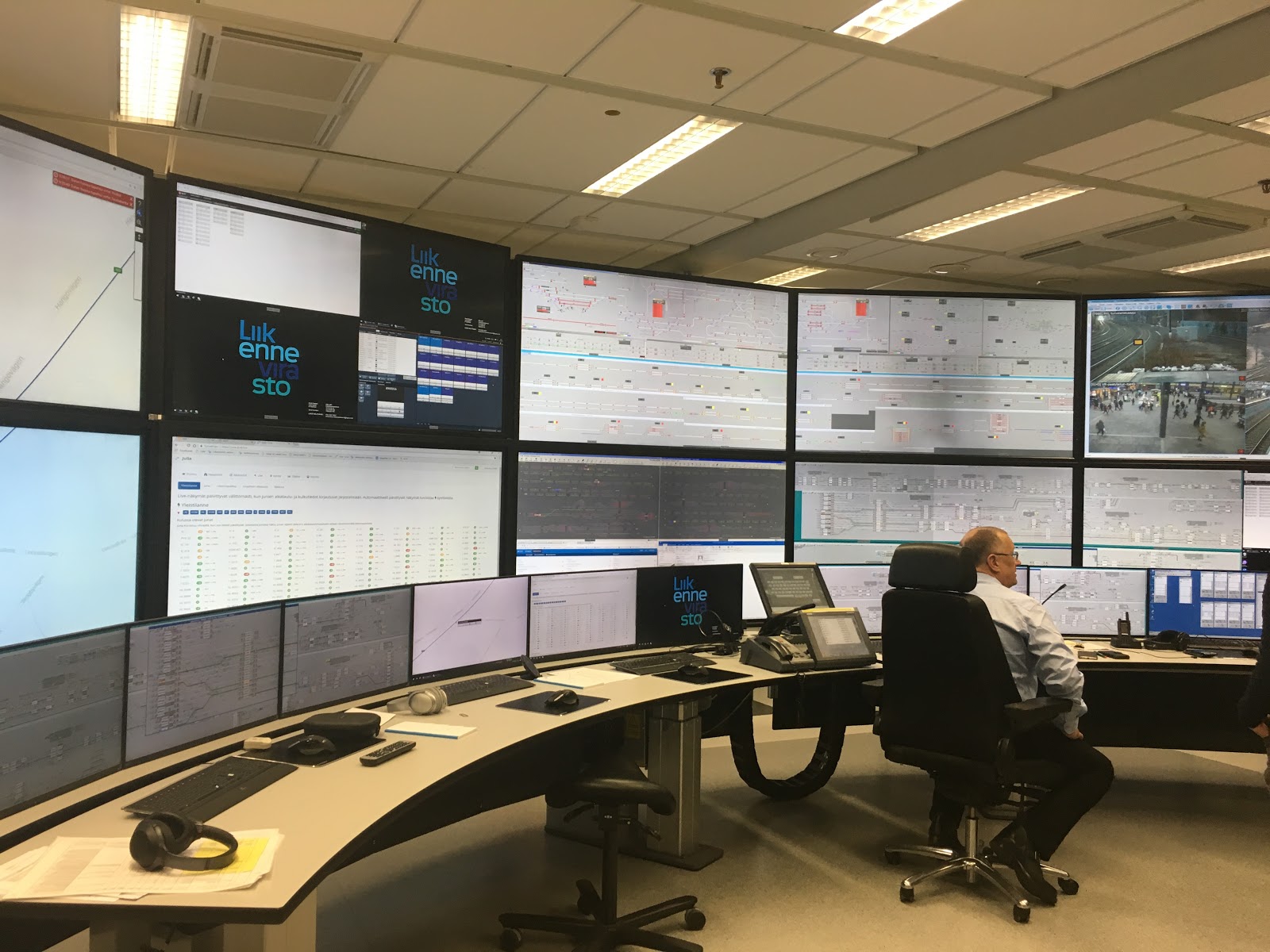
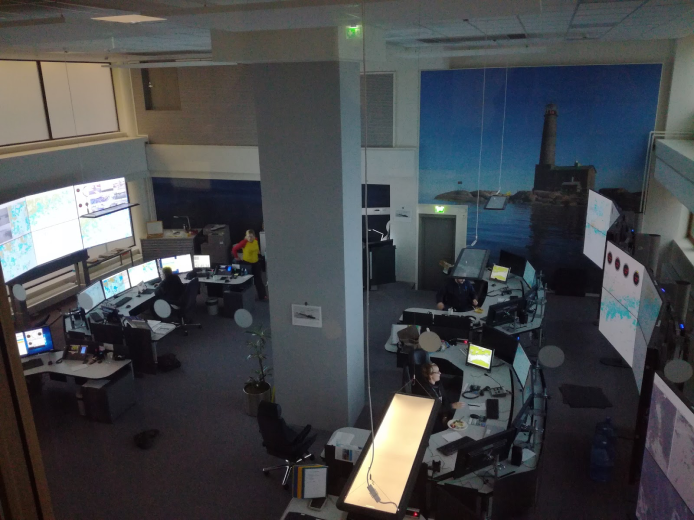
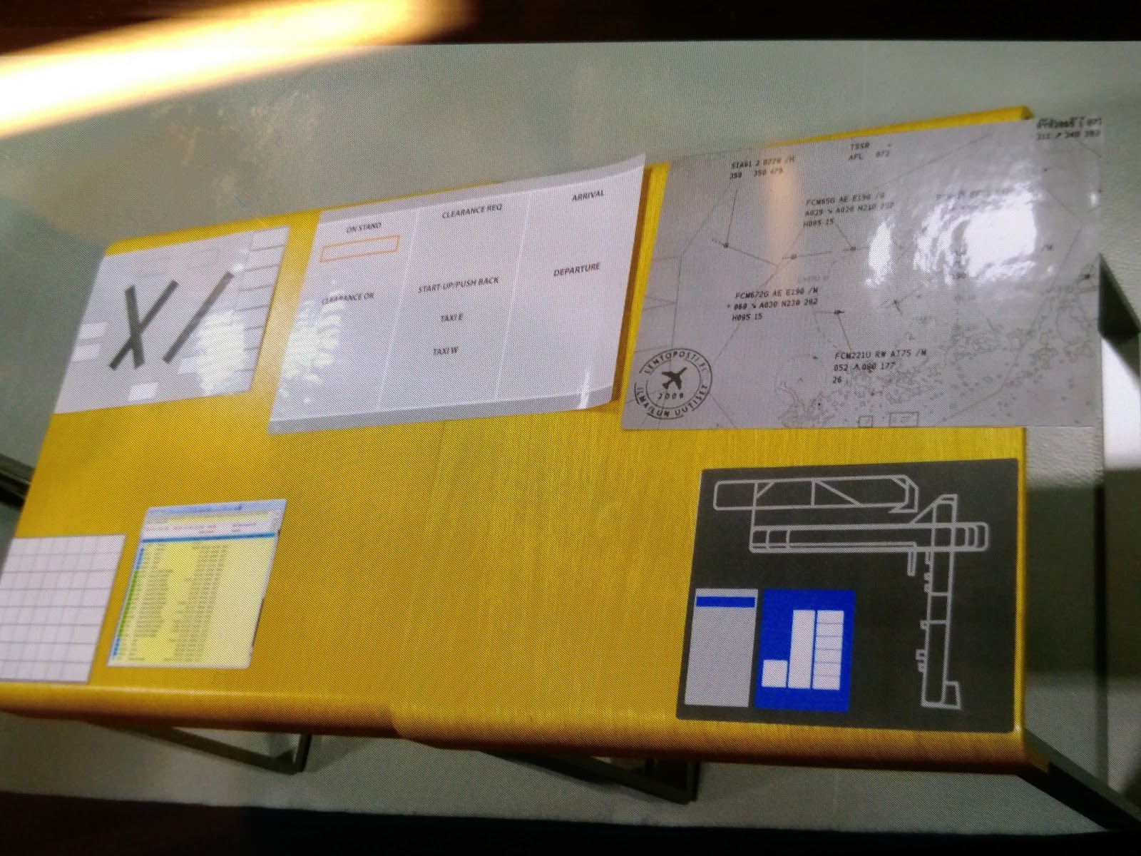
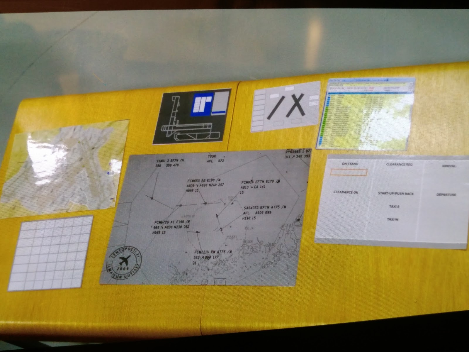
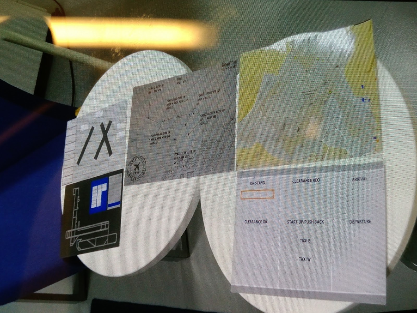
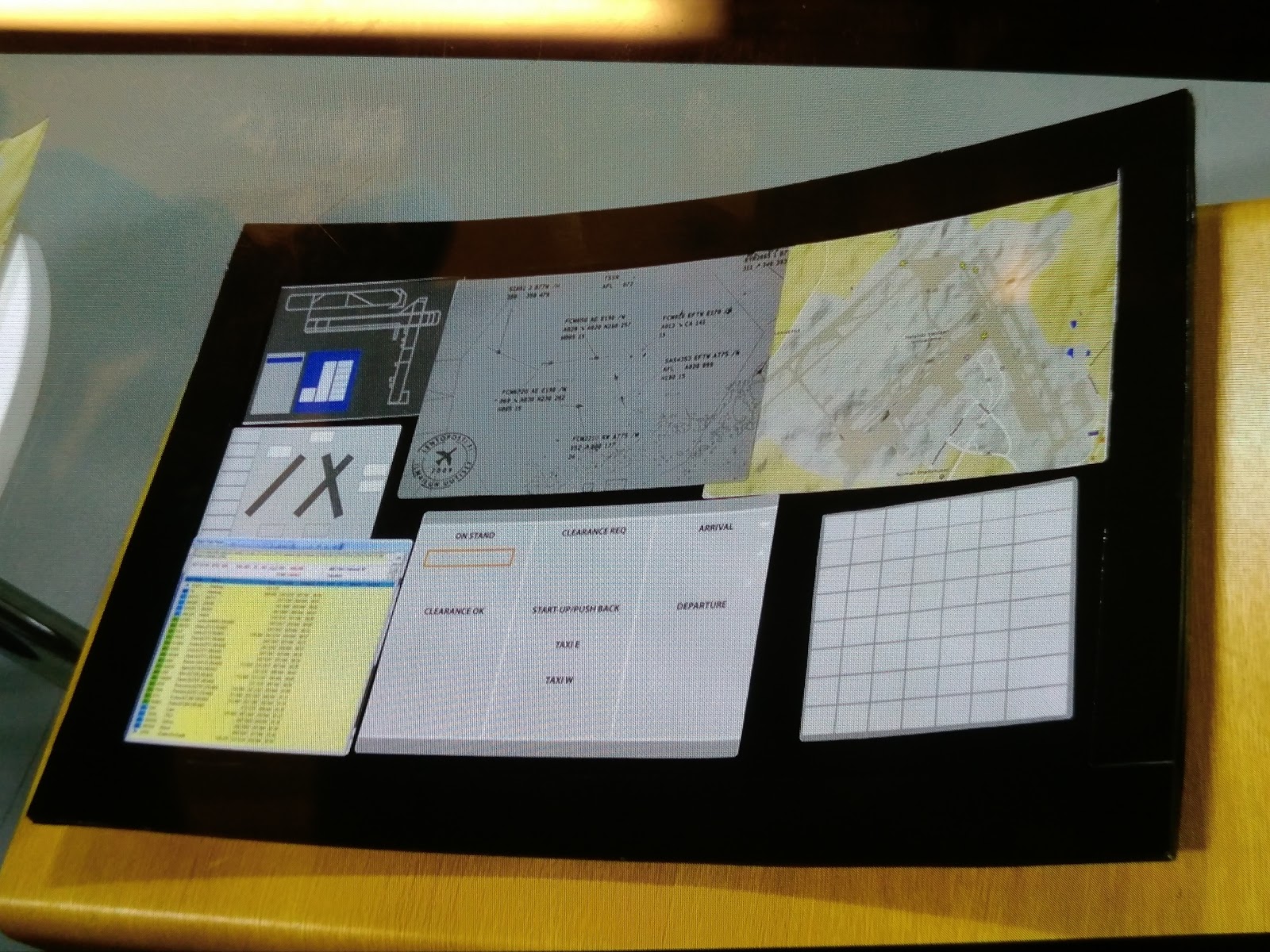
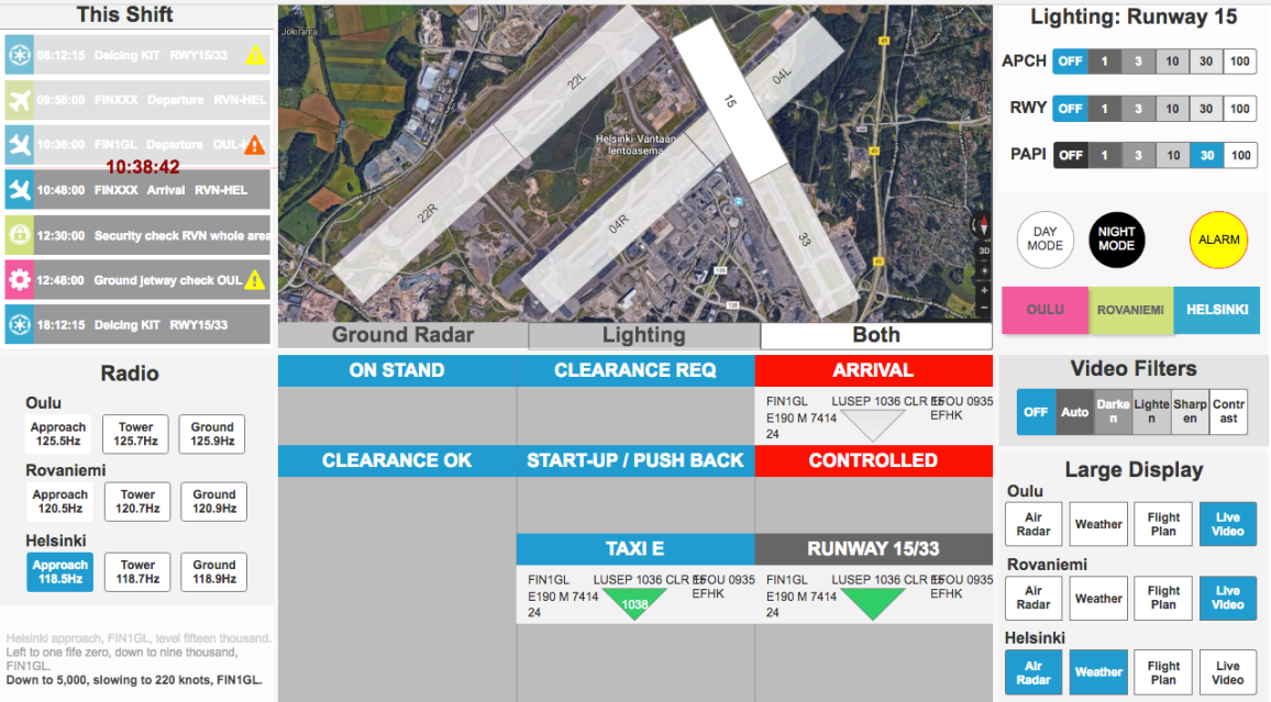
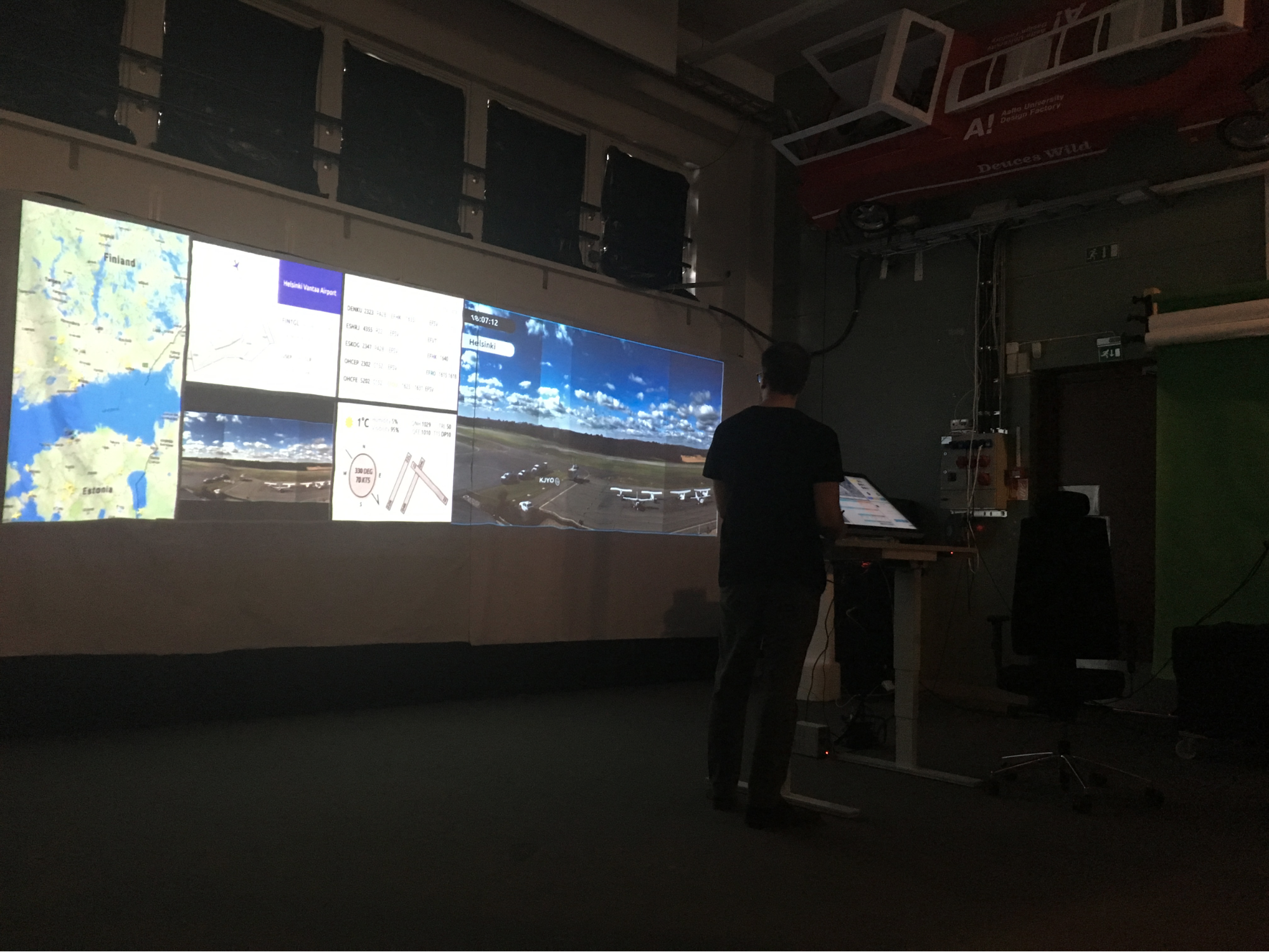
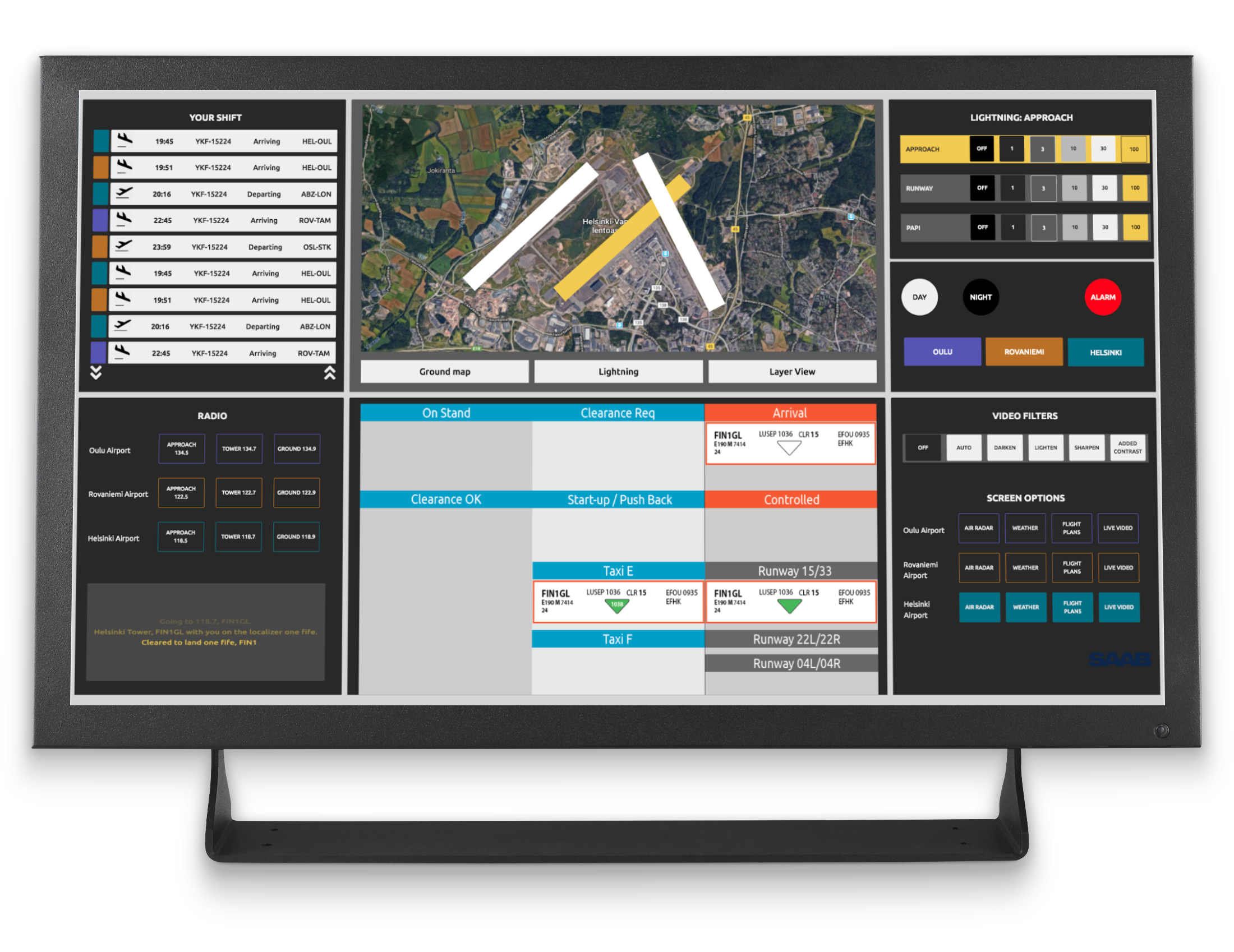
We think it would be beneficial to benchmark other existing control centers, to make comparisons and see where ATC stands. We visited a railway control center and a sea control center, surprisingly found they are already in remote working mode for a long time. For ATC, there are a lot to learn from rail and sea control centers:


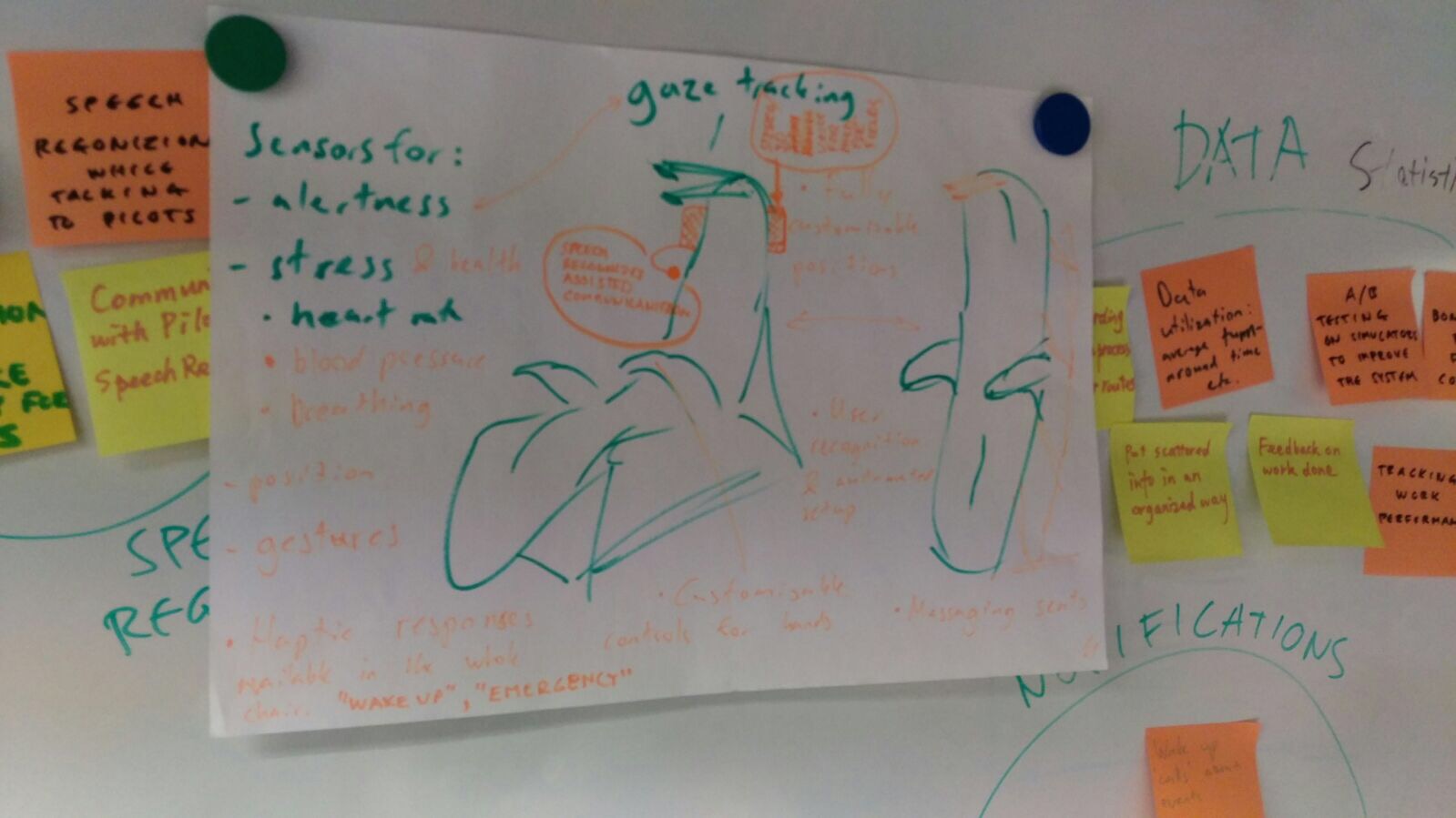
  • Automated: controllers only deal with emergencies;

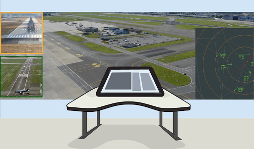
  • Modern: most systems are in responsive web design;

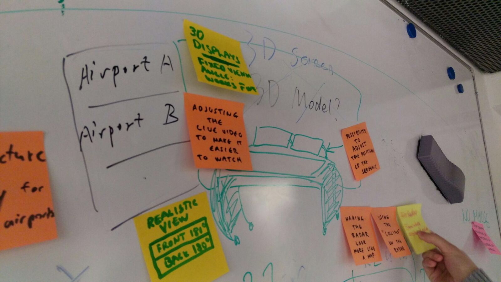
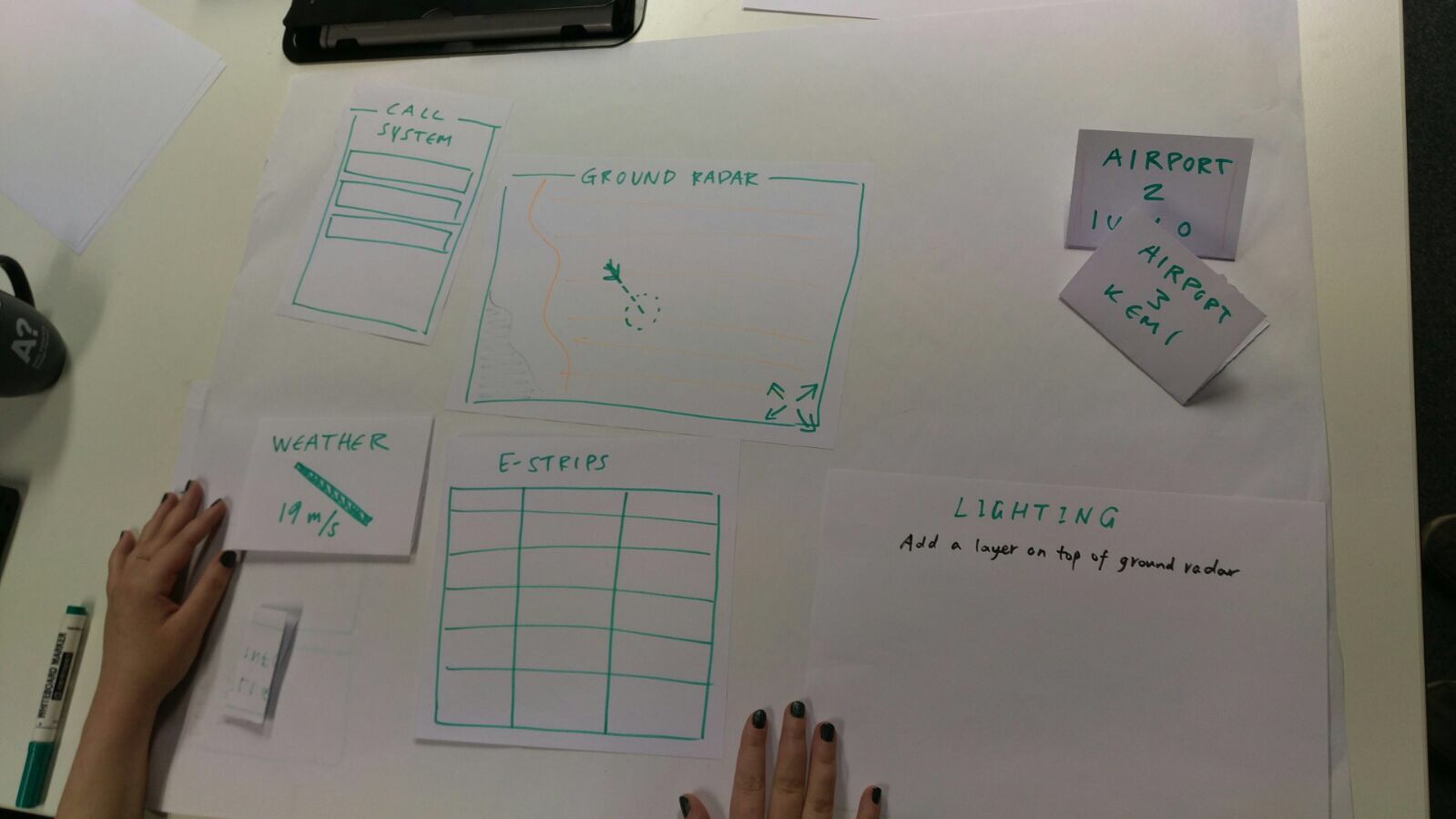
  • Customizable: height of displays and tables are adjustable, customized UI settings saved with ID;

  • Collaborative: possible to look out for colleagues taking a short time off.


Railway control center
Sea control center

Remote Tech Research


No more costly physical towers with 360 degree window at airports, workstations can be integrated in a control center that can be built anywhere. With large surrounding displays, air traffic controllers watch live streams from cameras set up at airports. One controller may control several airports at the same time in low traffic hours.


remote


We can have technology enhancement on the large surrounding displays, such as tracking the flights in the footage and adding augmented reality information right beside them. We can also mount IR cameras at airports to identify animals in case they mistakenly move to the taxiway or runway. For ATC, there are a lot to learn from rail and sea control centers:


tech

Ideation


Divergent Phase


After we collected data in user research, we continued with brainstorming and affinity diagramming. First we defined 4 categories that our sponsor cared most about as a starting point for our brainstorming:

“accuracy”, “efficiency”, “safety” and “comfort”.

Then we tried to think individually in or out of those 4 categories and write down ideas on post-its. We collected and grouped those similar post-its together, and came up with possible solutions combining with features from them.


Large displays
Touch screen
Haptic chair

Convergent Phase


We picked the most promising ones and tried to simplify them and integrate into a workstation: office chair with haptic warning in case of emergency (light and sound warning as well), enhanced information on large displays that currently show live streams from airports, and touch screen with control panels mounted to an adjustable tabletop.


workstation

Design


Cardboard Prototype: Card Sort Test


In order to know which control panels are the most important ones to air traffic controllers, and how big the touch screen can be, we conducted user testing with Avia College students who are trained to be future air traffic controllers.


Nine people were tested in a "free organization" task with the cardboard prototype. They were told that the organization doesn’t need to follow the normal way the systems are organized in the air control workstation or simulator. Prototype is a model of the touch screen and included pictures of different air control systems generally used (air radar, ground radar, flight plans, lighting, weather, strip-system, radio/phone) in two or three different sizes for each system and a cardboard model of 32” inch standard touchscreen.


In the first part of the test, the subjects were asked to organize the systems on the table next to them, according to their personal liking and what they would think is a good workflow for them.


In the second part they needed to choose proper size to fit everything into the 32” inch cardboard.


In this “free organization” all of the nine students placed the radar and strips in the middle. They also picked the large sized versions of the radars and strips. They explained that the radar and strips are their main tools and they want them to be the easiest to look at and interact with. The placement of the other systems (weather, lighting, radio/phone and flight plans) varies from person to person. Often the subjects called them “additional” or “secondary” tools. They also rationalized their decisions of placement and size of the other systems with the frequency of that system used.


Paper Prototype


In making the paper prototype, we drilled down to detail information on each control panel on the touch screen and sections of large display, as well as the interaction between them. After that, we had a workshop on the workflow of a plane landing scenario and tried role play of pilot and approach/tower/ground air traffic controllers to walk through the whole scene with our paper prototype. The whole team had better understanding of the workflow and clarified some questions we need to verify with air traffic controller testing.


paper prototype


Clickable Wireframe


We got input from remote air traffic controllers and refined our prototype.


Integrated Workstation


We exhibited the workstation prototype in PdP Gala at Aalto Design Factory. In the exhibition, we made three ID cards with different settings. Visitors can change an ID and see the height of the table and the angle of the screen change accordingly.


workstation
night mode

Key Takeaway


After the project, I reflected on the whole process and found several key points to keep in mind:


  • For non-standardized devices such as workstations, there are no existing UI patterns about the size of screens or components, which should be decided after tests with users;

  • For an integrated workstation, ergonomics should be considered and many design details lie in hardware addons beyond the screens;

  • For specialized users, user studies are never enough. We should always base our design decisions on real user data rather than any asumption.