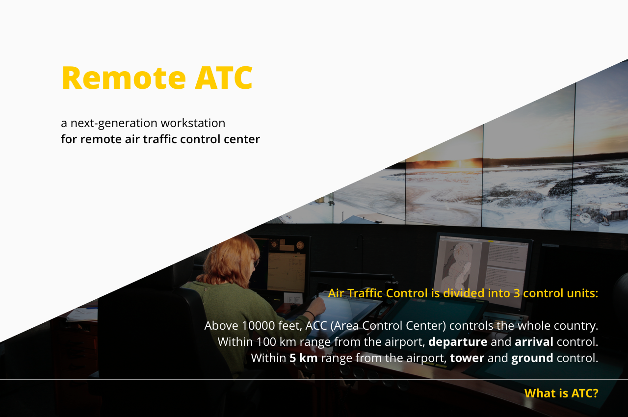
Remote ATC
Research and design / Air traffic control / Workstation
SAAB wants to promote air traffic control center and remote digital towers, and improve the safety of air traffic control and working experience for the air traffic controllers. They come to Aalto Design Factory Product Development Project course, and look for new ideas from young minds. We form a team WASP (We Are Saab Project) and cooperate with them to find possible solutions.
Understanding ATC workflow
Because ATC (Air Traffic Control) is a rather new area for us, we spend quite some time to understand what ATC really means.
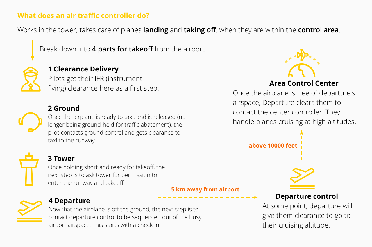
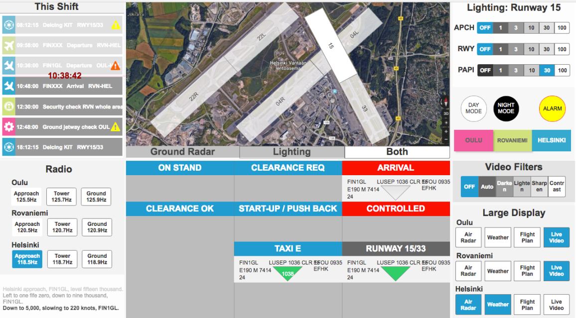
What’s new with remote Air Control Center?
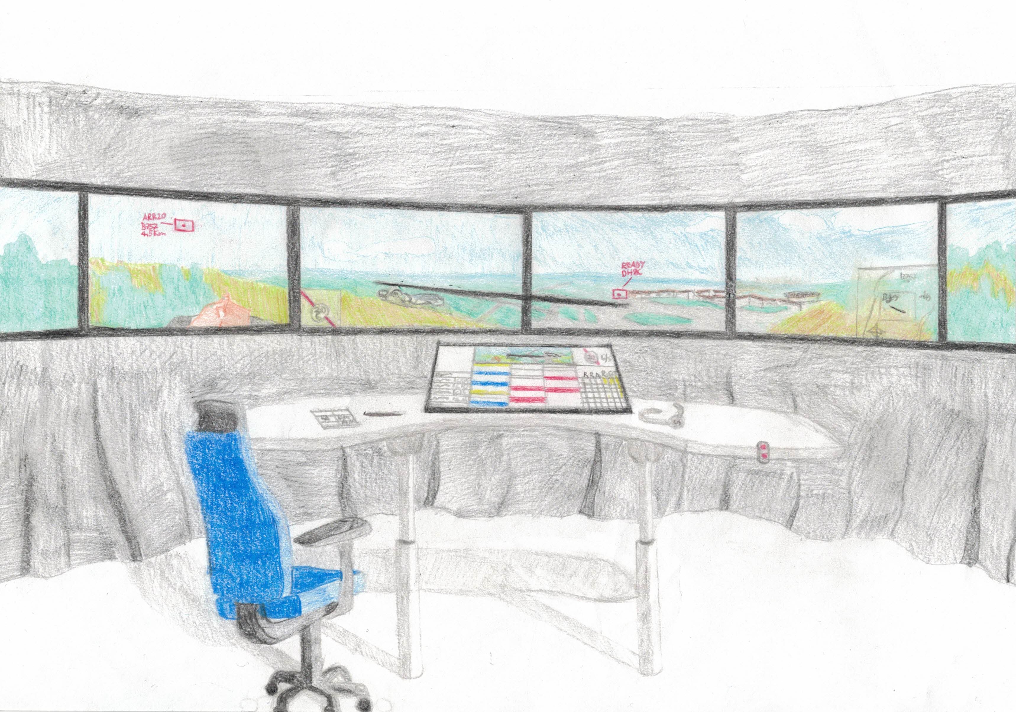
No more costly physical towers with 360 degree window at airports, workstations are integrated in a control center that can be built anywhere. With large surrounding displays, air traffic controllers watch live streams from cameras set up at airports. One controller may control several airports at the same time in low traffic hours.
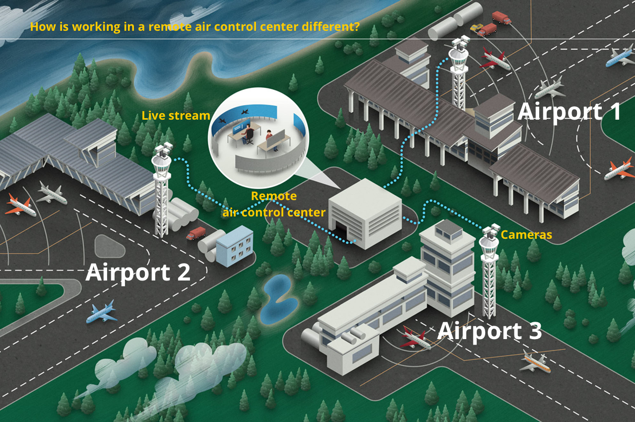
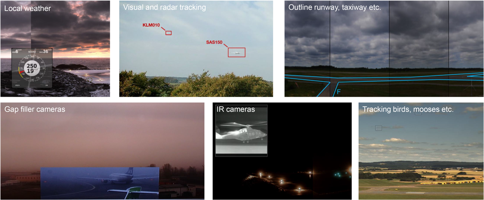
Possibility with remote air control center
We can have technology enhancement on the large surrounding displays, such as tracking the flights in the footage and adding augmented reality information right beside them. We can also mount IR cameras at airports to identify animals in case they mistakenly move to the taxiway or runway.
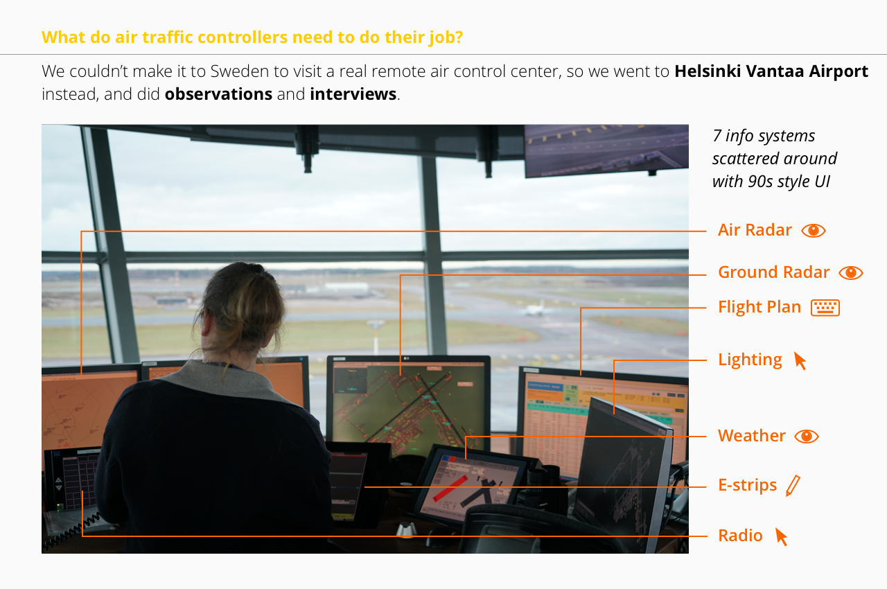
User research to gather insights
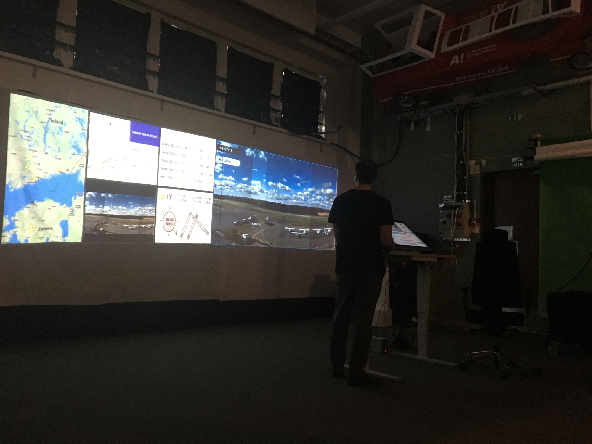
To understand our end users’ working process, we wanted to visit control towers or centers to do observations and interviews with air traffic controllers. We haven’t made it to Sweden to visit a real remote air control center yet, and went to Helsinki Vantaa Airport instead.
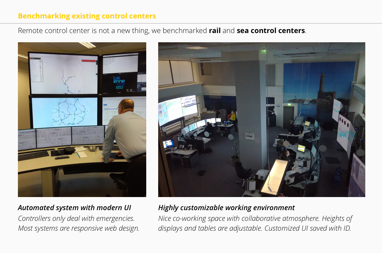
Benchmarking
Remote control center is not a new invention. We benchmarked rail and sea control centers. It’s interesting that we found railway control is highly automated and sea control is quite modernized. On the contrary, air traffic control seems to be lagging behind.
Ideation
After we collected data in user research phase, we continued with brainstorming and affinity diagramming. First we defined 4 categories that our sponsor cared most about as a starting point for our brainstorming: “accuracy”, “efficiency”, “safety” and “comfort”. Then we tried to think individually in or out of those 4 categories and write down our ideas on post-its. We collected and grouped those similar post-its together, and came up with possible solutions combining with features from them.
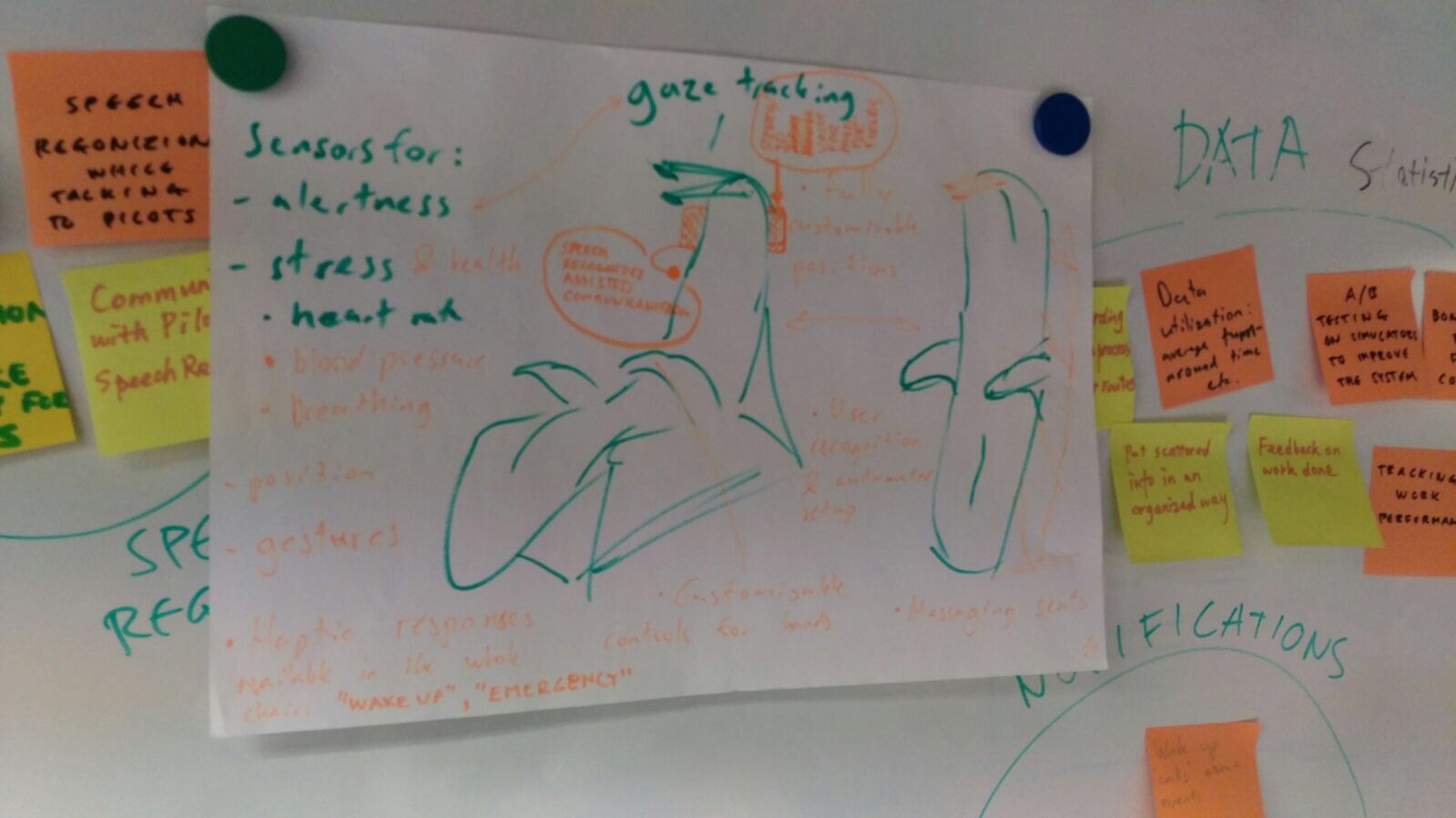
We picked the most promising ones and tried to simplify them and integrate into a workstation: office chair with haptic warning in case of emergency, enhanced information on large displays that currently show live streams from airports, and touch screen with control panels mounted to an adjustable tabletop.
I worked with another designer on the idea of the touch screen and the large display, which are the UI parts; other engineers worked on the rest mechanical parts.
Design round 1 : cardboard prototype
In order to know which control panels are the most important ones to air traffic controllers, and how big the touch screen can be, we conducted user testing with Avia College students who are trained to be future air traffic controllers.
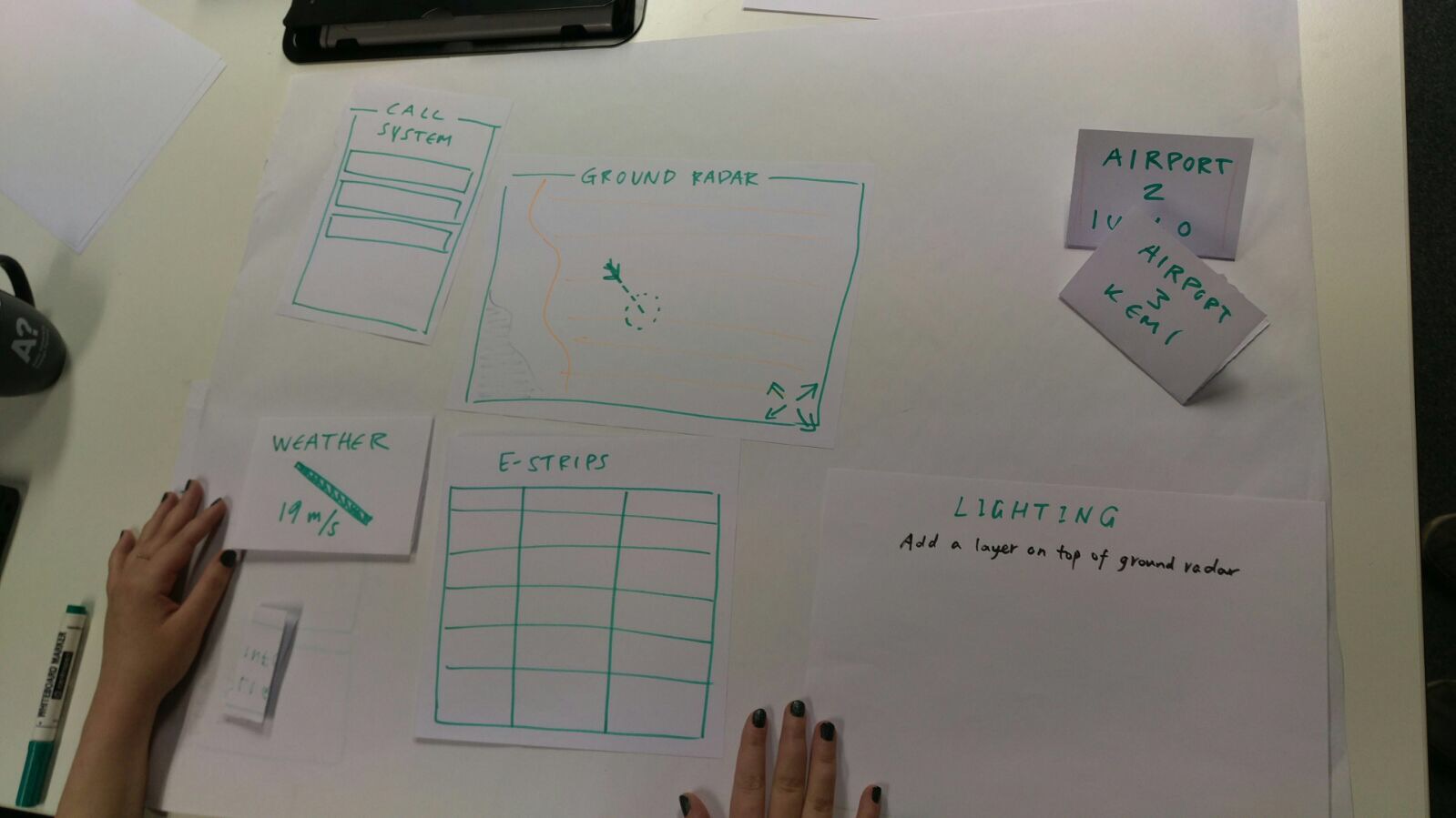
Nine people were tested with the cardboard prototype. Prototype is a model of the touch screen and included pictures of different air control systems generally used (air radar, ground radar, flight plans, lighting, weather, strip-system, radio/phone) in two or three different sizes for each system and a cardboard model of 32” inch standard touchscreen.
In the first part of the test the subjects were asked to organize the systems to the table next to them according to their personal liking and what they would think is a good workflow for them; in the second part they needed to choose proper size to fit everything into the 32” inch cardboard. They were also told that the organization doesn’t need to follow the normal way the systems are organized in the air control workstation or simulator. After this they were asked to explain their decision making.
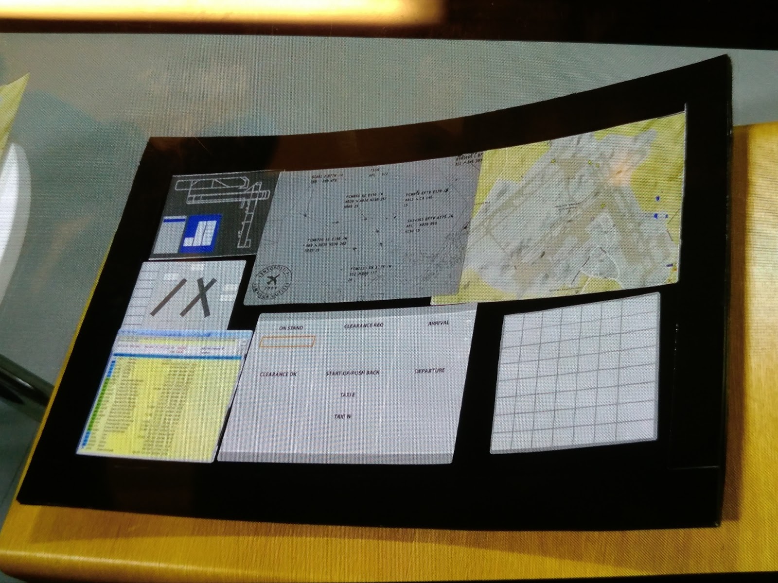
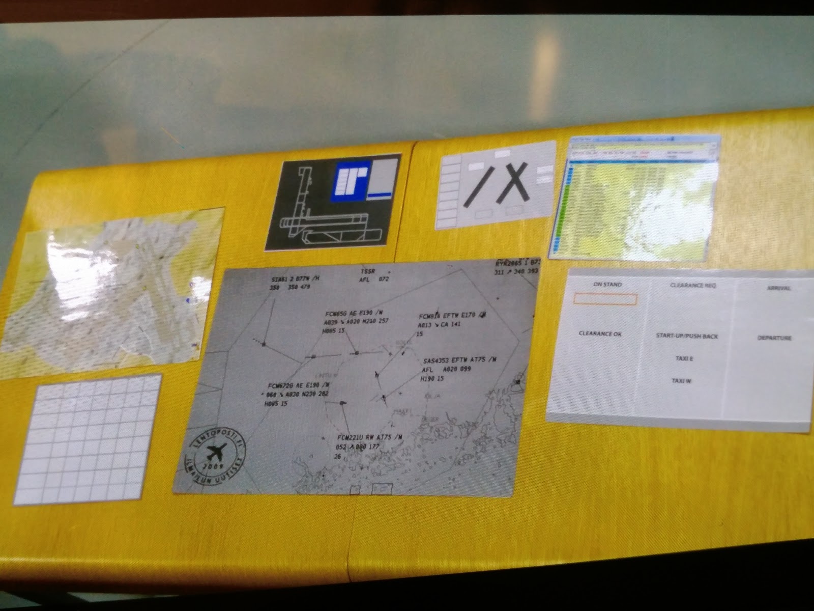
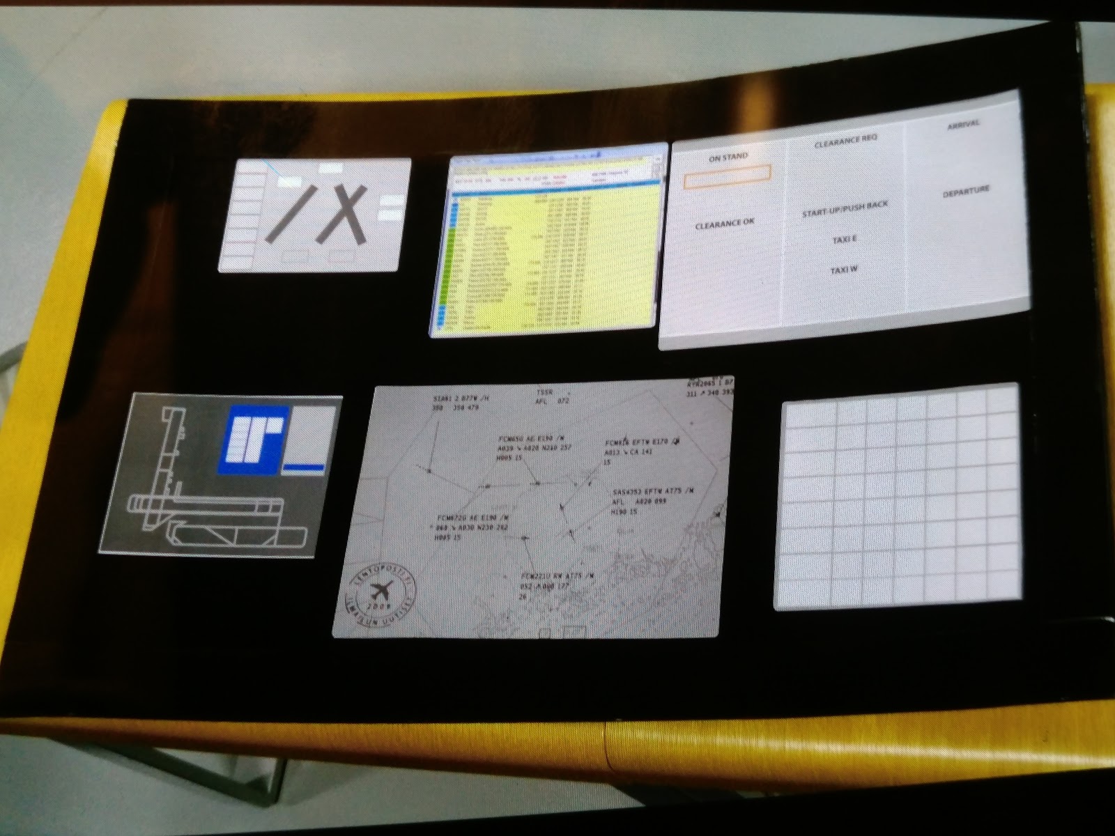
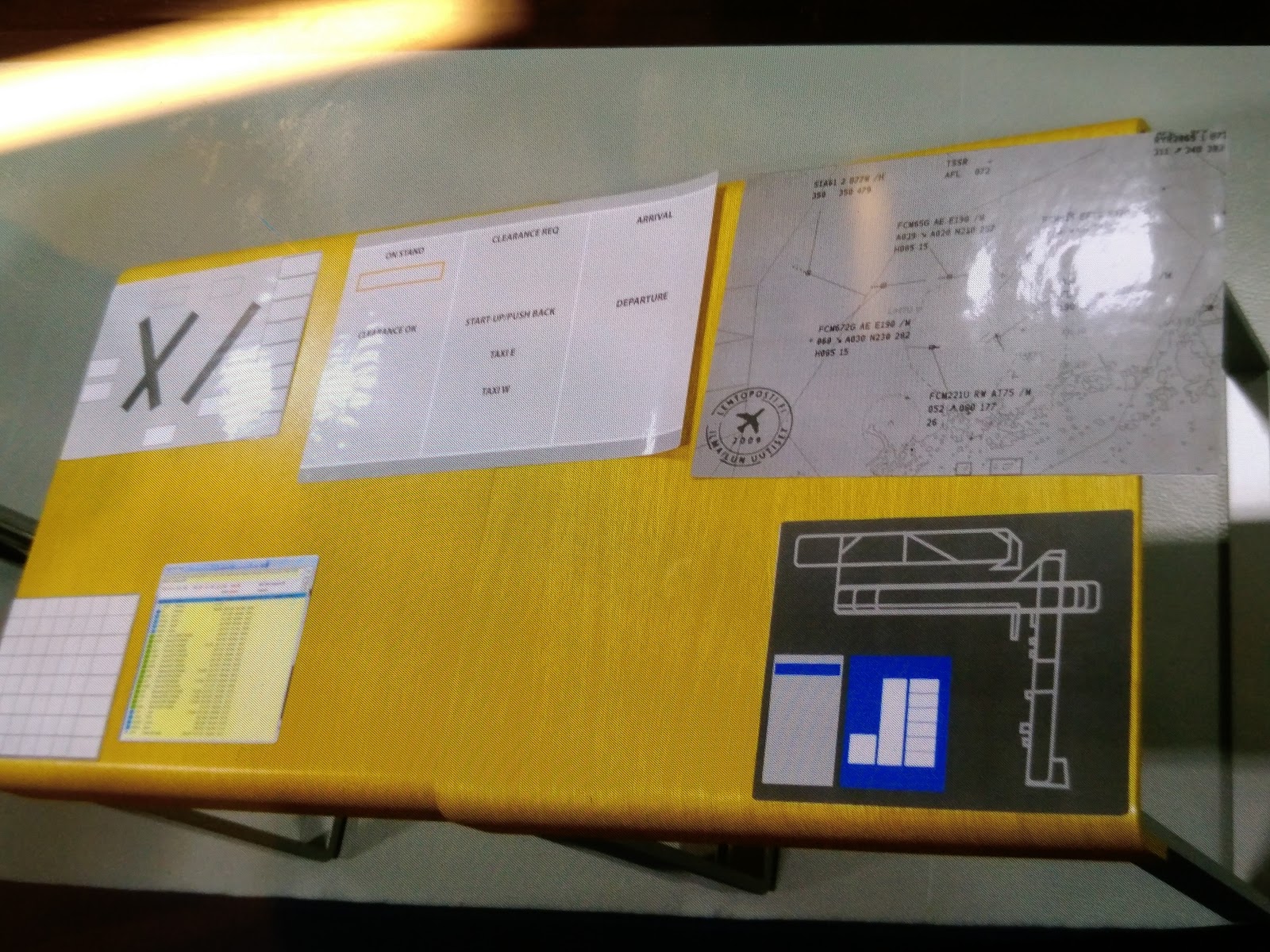
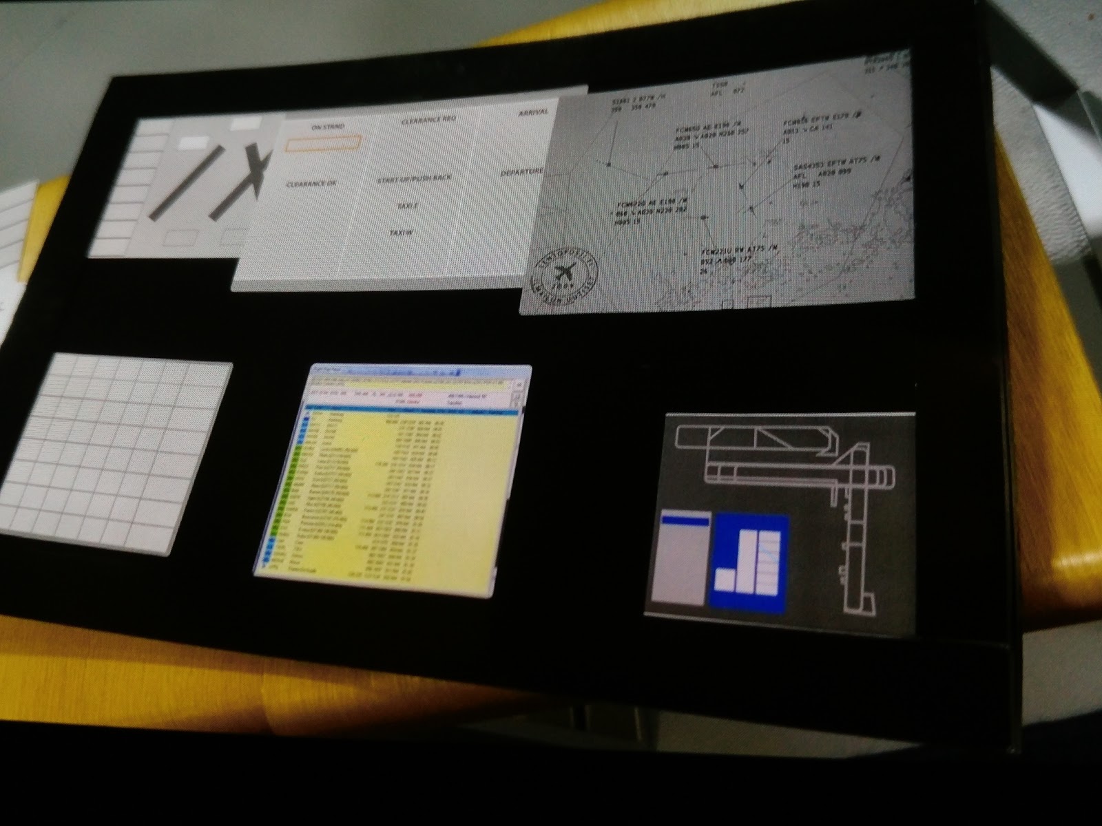
In this “free organization” all of the nine students placed the radar and strips in the middle. They also picked the large sized versions of the radars and strips. They explained that the radar and strips are their main tools and they want them to be the easiest to look at and interact with. The placement of the other systems (weather, lighting, radio/phone and flight plans) varies from person to person. Often the subjects called them “additional” or “secondary” tools. They also rationalized their decisions of placement and size of the other systems with the frequency of that system used.
Design round 2 : paper prototype
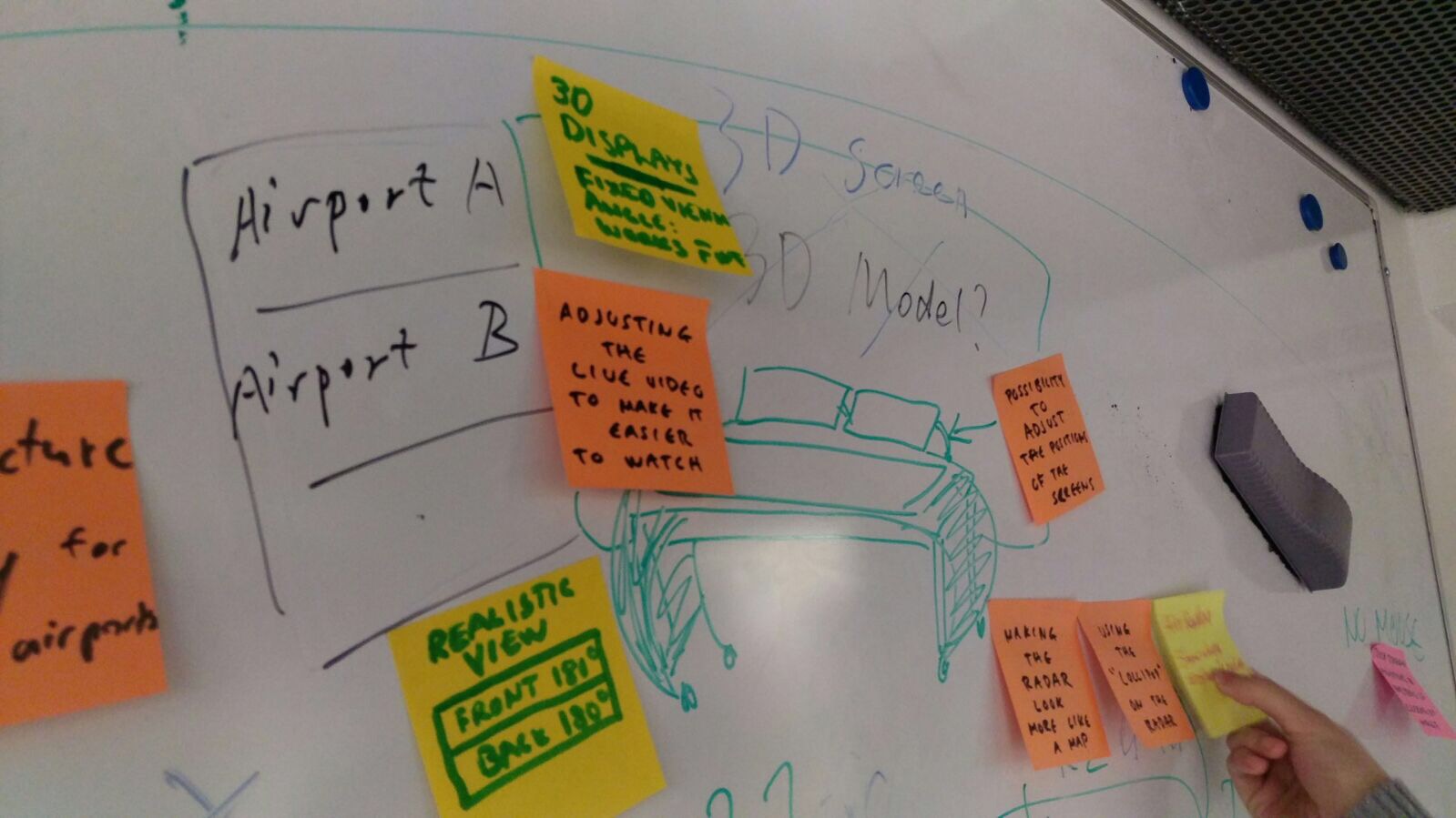
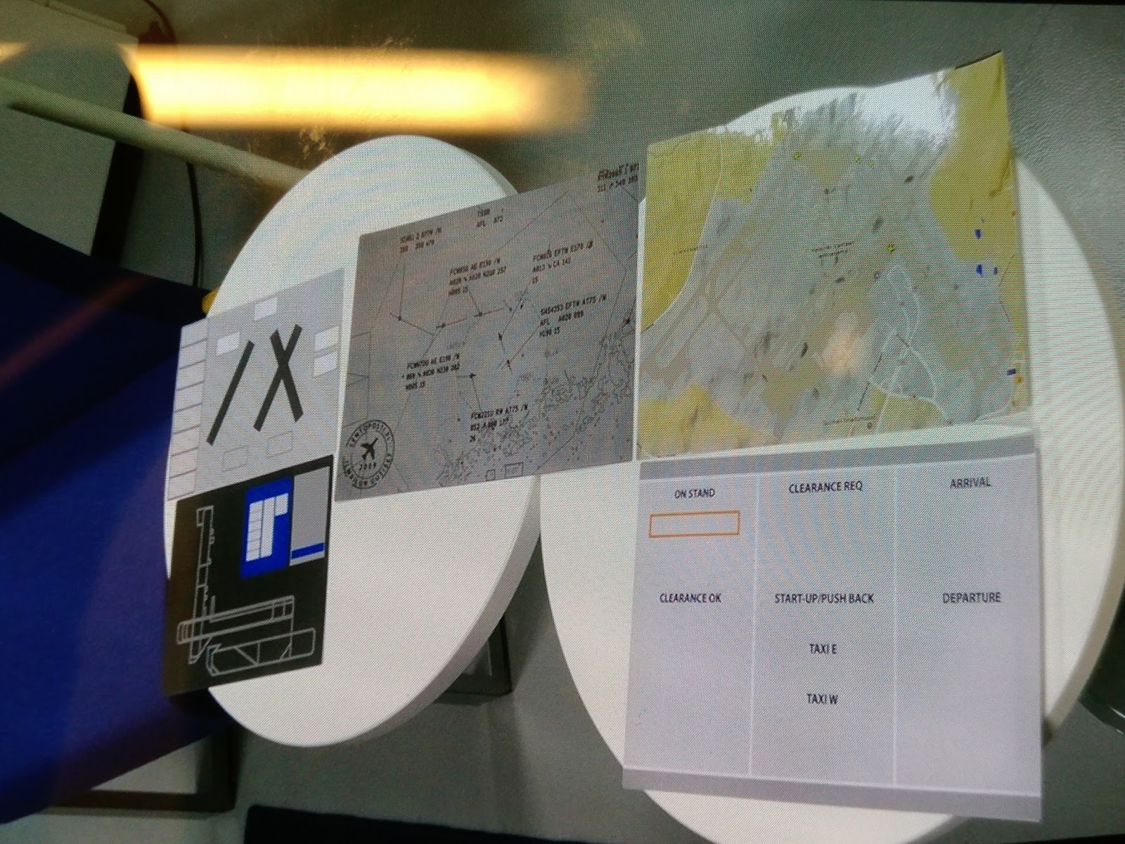
We visited remote students on our team in Porto, Portugal and designed paper prototype of the touch screen and the large display together. We drilled down to detail information on each control panel on the touch screen and sections of large display, as well as the interaction between them.
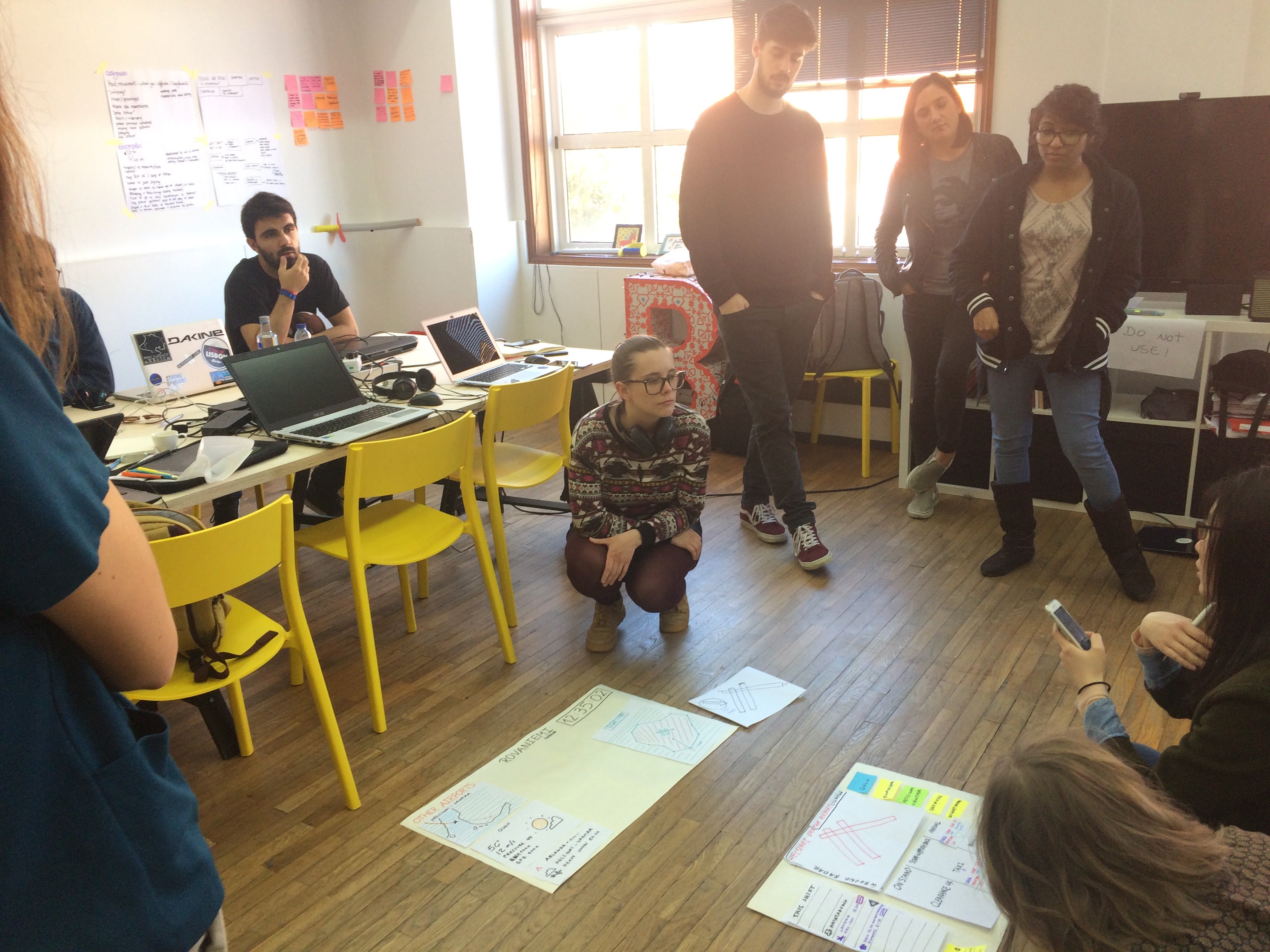
We also had a quick workshop with design teachers and students from local New Digital School, to get input from design experts. We focused on the workflow of a plane landing scenario and tried role play of pilot and approach/tower/ground air traffic controllers to walk through the whole scene with our paper prototype. The whole team had better understanding of the workflow and clarified some questions we need to verify with air traffic controller testing.
Design round 3 : clickable wireframe
We got input from remote air traffic controllers and refined our prototype.
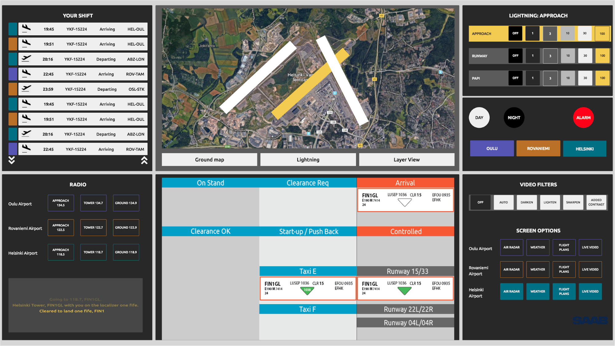
Design round 4 : integrated workstation
We exhibited the workstation prototype in PdP Gala at Aalto Design Factory.